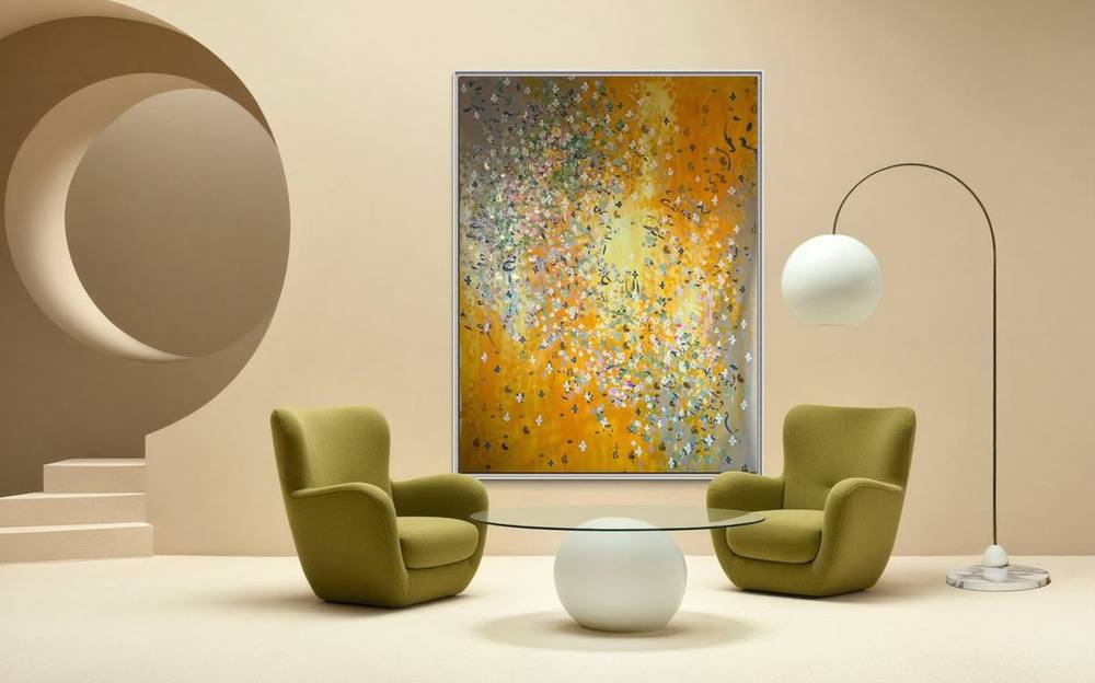
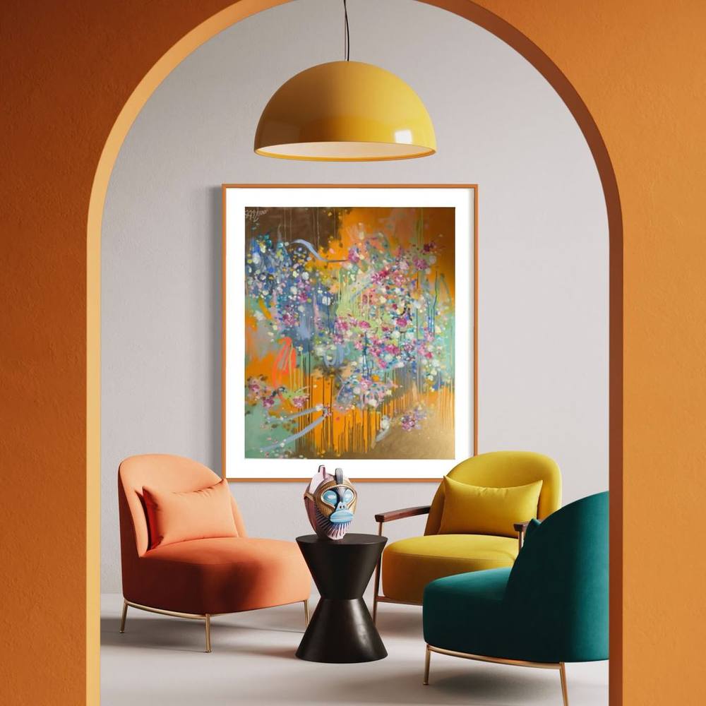
Living room art – format, light and how to hang it
The living room is where a picture is seen most often. How to find the right size, how high to hang it, and which light suits it.
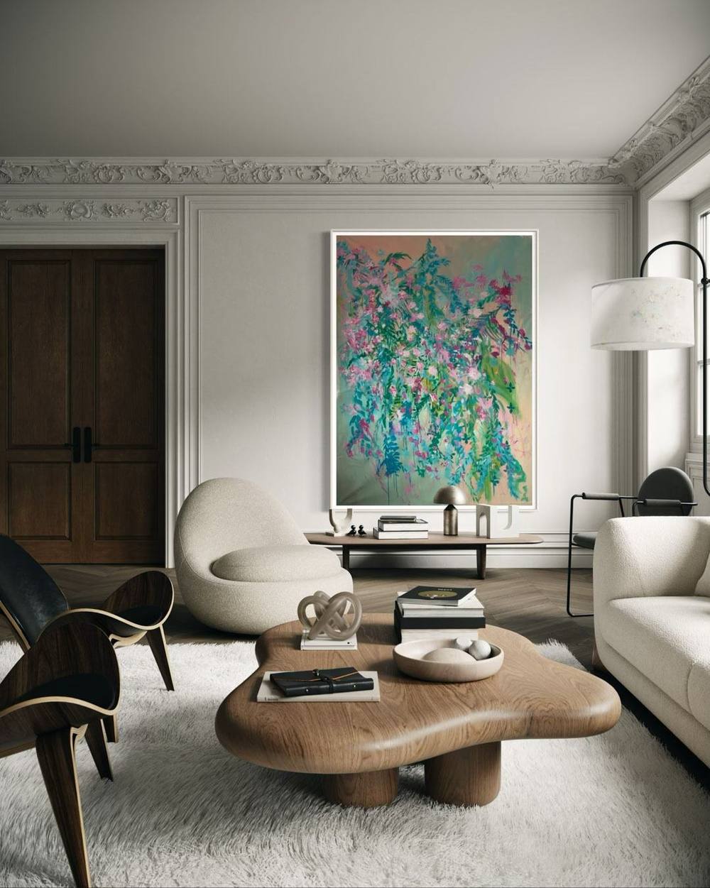
The living room is where a picture is seen most often: in the cool light of morning, under the lamp in the evening, in passing and sometimes for a whole hour. Living room art therefore has to do more than decorate. It gives the room a centre, a temperature, a mood. This guide shows how to find the right work and hang it so that it can unfold its effect.
Begin with the room, not the picture
Before thinking about colours and motifs, it is worth taking a calm look at the room itself. Where does the eye fall when you enter? Which wall is free, which is defined by furniture? How high is the ceiling, how much daylight comes in, and from which direction?
Many living rooms have a main wall: above the sofa, opposite the window or above the fireplace. That is where the most important work belongs. Smaller pieces find their place beside doors, above chests of drawers or in alcoves, where one can come closer to them.
The right size
Above the sofa
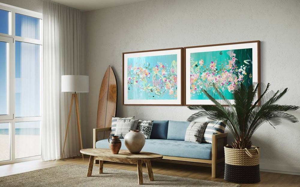
A common rule of thumb suggests a picture about two thirds of the sofa's width, with two thirds to three quarters as a deliberate range. For a sofa of 240 centimetres, that means a picture width of 160 to 180 centimetres – either as one work or as a pair. A picture narrower than half the sofa, by contrast, quickly looks lost.
Large formats such as 09 | 2026 at 150 × 200 centimetres or the square 04 | 2025 at 200 × 200 centimetres hold an entire wall on their own. Those who prefer to combine can hang two related works side by side with a gap of about 8 to 10 centimetres.
Portrait, landscape, square
Landscape formats emphasise the width of a room and feel calm, almost like a view. Portrait formats stretch a room upwards and suit high period walls or narrow wall sections between windows. Square formats are the most neutral choice: they keep the balance and fit almost any furnishing.
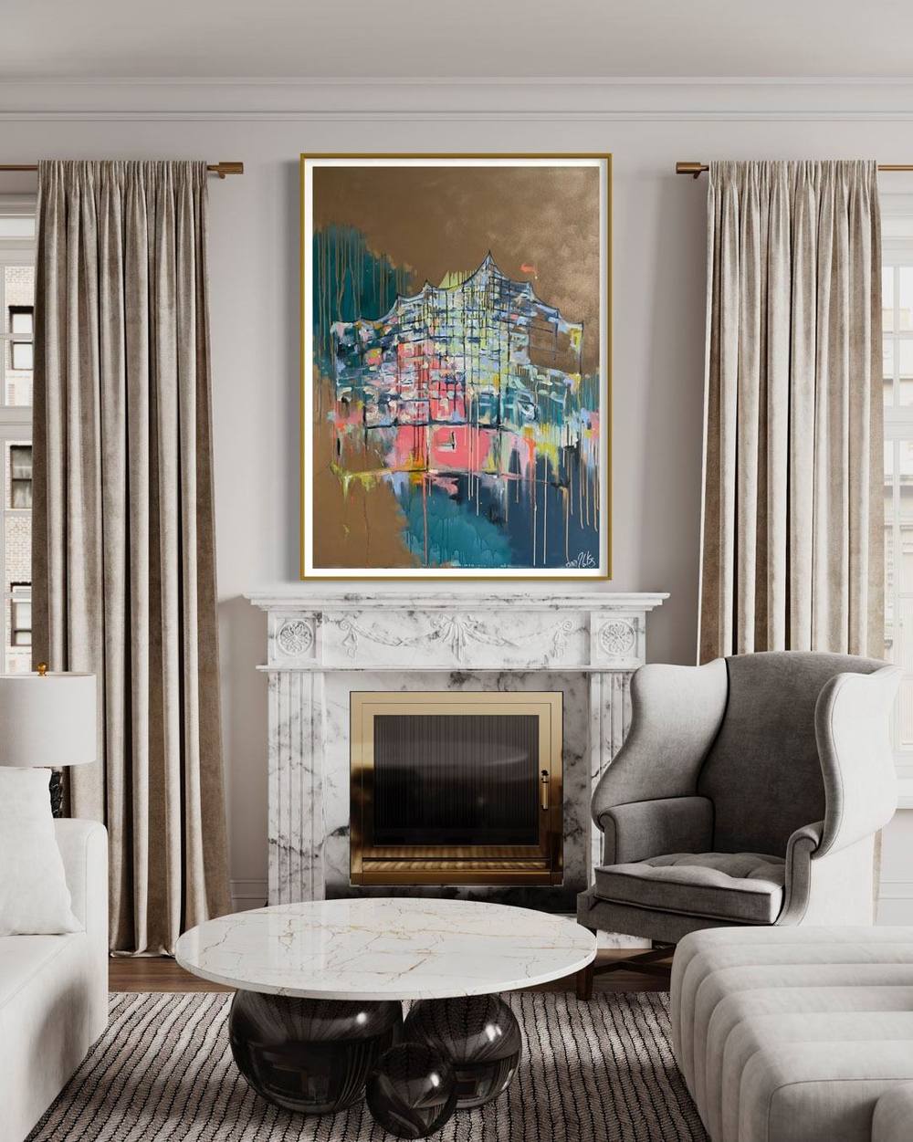
Above the fireplace
The fireplace is the classic centre of a living room. A work above it should not exceed the width of the mantelpiece and should hang with some distance above it. It matters that no direct heat or soot reaches the picture; with an open fire, another wall is often the better choice.
In an open-plan living space
Many homes combine kitchen, dining area and living room into one space. Here it helps to think in sightlines: which wall do you see from the dining table, which from the sofa, which on entering? A large work at the end of a sightline connects the zones; smaller pieces can mark individual areas. What matters is that the pictures speak to one another – through a shared colour or the same series, for instance – rather than compete for attention.
In a small living room
A small room can take surprisingly large pictures, as long as there is only one. A single strong format can open a wall like a window, whereas many small frames make a tight room restless. Light, airy pictures with plenty of open space make a room feel larger.
Several pictures: pair, row, group
Not every wall needs a single work. Two related pictures as a pair feel calm and classic; three works of equal size in a row emphasise the width of a room. A dense group of many formats, often called a salon hang, depends on a fixed outer frame: first define the outer edges of the group, then arrange the pictures within it at consistent gaps. Before drilling, it is worth laying out the arrangement on the floor or marking it on the wall with paper.
The three parts of the triptych from the Signature Collection, such as 53 | 2021, show how several portrait formats can structure a wall together.
How high to hang it
Most pictures hang too high. A proven rule, used by museums as well: the centre of the picture sits about 145 to 155 centimetres – roughly 57 to 60 inches – above the floor, at about the eye level of a standing adult.
Above furniture, a second rule applies. Leave about 15 to 25 centimetres between the top of the sofa back and the bottom of the picture. This way furniture and picture visibly belong together, without the frame being touched when someone leans back.
With several works, a shared centre line helps. All picture centres sit at the same height, and the gaps between the works are equal. This feels orderly, even when the formats differ.
Light that flatters and protects
Light decides how a painting looks – and how long it stays that way. Direct sun should never fall on an original: UV radiation fades pigments and can age surfaces. Conservation guidance gives around 200 lux as a reference value for light-sensitive paintings.
For the living room, this means indirect daylight and, in the evening, warm-white LED spotlights with low UV, angled from above onto the picture so that no reflections form. With works in gold leaf or gold lacquer, it is worth experimenting with the light. Depending on the angle, the gold glows warmly or recedes – and this very change is its appeal.
The effect of colour
A picture changes the temperature of a room. Warm tones such as rosé, apricot and gold make a room inviting and sociable; cool tones such as blue, petrol and sage bring calm and breadth. Strong pinks and oranges set accents in quietly furnished rooms.
There is no need to match the colour of the picture to the sofa. It is often more appealing when a work picks up a colour that appears only softly in the room – in the wood, a cushion or the green of plants – and strengthens it.
The wall as backdrop
The colour of the wall plays its part too. A warm white or a light sand tone lets almost any picture breathe and is the safest choice. Dark walls – green, blue or anthracite – can give works with gold and strong colours an almost museum-like depth; gold glows more strongly against a dark ground. Very lively wallpapers, by contrast, compete with the picture. A work with many fine details is best given a calm surface.
Mood rather than motif
Many people choose a picture by what it shows. For the living room, it is worth asking instead about mood: should the room come to rest or become livelier, radiate warmth in the evening or freshness by day? An abstract work leaves more room here than a figurative one, because it changes with the light and with one's own state of mind. That is why the works in the catalogue can also be filtered by moods such as calm, poetic or powerful.
Living with an original
A painting in the living room shares daily life: heating, candles, children and pets. A few simple rules protect it. No original should hang above radiators or right next to a fireplace, as warm, dry air strains the canvas. Candles do not belong beneath a picture; their soot settles on the surface. Dust is removed with a soft, dry brush, never with damp cloths or cleaning agents; with gold leaf and lacquer, restraint is enough. And a solid hook, suited to the wall and the weight, is the best insurance against damage.
Original or print?
For the living room – the room where you see a picture every day – an original is worth it. The surface of a painting has a depth no print reproduces: layers of paint, brushstrokes, running paint, the shimmer of gold. An original changes with the light of the day. How to approach buying one is described in the guide to buying abstract art.
Certainty before deciding
If you are unsure whether a work suits your space, Juliane Golbs offers two options.
The size comparison. Every work page shows the picture true to scale beside a door, a sideboard and an armchair. This makes it possible to judge the effect of a format before reaching for the tape measure.
Hanging on trial. For a small fee that is credited on purchase, an original comes to your own room on trial. There it shows how it looks in the morning light and in the evening.
The art advisor makes the path to the right work easier: it asks about colour world, wall size, mood and budget and shows the available originals that match. Those who would like a work made for a particular wall will find the process described in the article on commissioning art.
In short
Good living room art hangs at eye level, takes up about two thirds of the width of the furniture below, receives indirect light and a colour that transforms the room. Everything else is feeling – and that shows best in front of the original. The catalogue of works contains all available works by Juliane Golbs, filterable by colour, format and size.
Frequently asked questions
How big should a painting above the sofa be?
A common rule of thumb suggests about two thirds of the sofa's width, with two thirds to three quarters as a deliberate range. A picture narrower than half the sofa quickly looks lost.
How high should a painting hang in a living room?
The centre of the picture usually sits about 145 to 155 centimetres (57 to 60 inches) above the floor, roughly at eye level. Above a sofa, leave about 15 to 25 centimetres between the back of the sofa and the bottom of the picture.
What light is suitable for paintings in a living room?
Indirect daylight without direct sun, and warm-white LED lighting with low UV. Conservation guidance gives around 200 lux as a reference value for light-sensitive paintings.
Can I try a work by Juliane Golbs in my living room before buying?
Yes. For a small fee that is credited on purchase, an original can be hung on trial. In addition, every work page shows a true-to-scale size comparison with a door, a sideboard and an armchair.