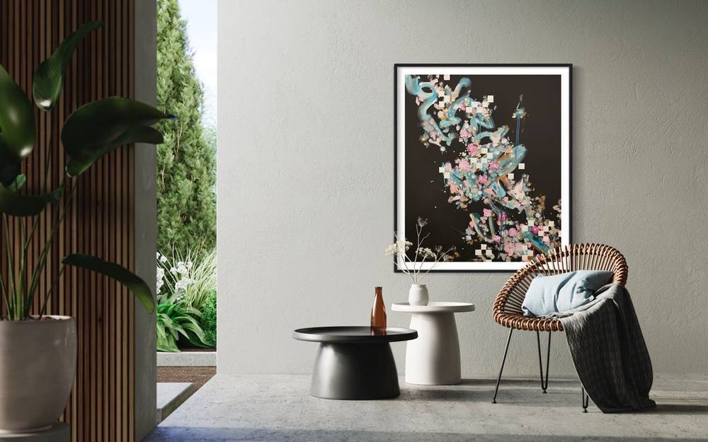
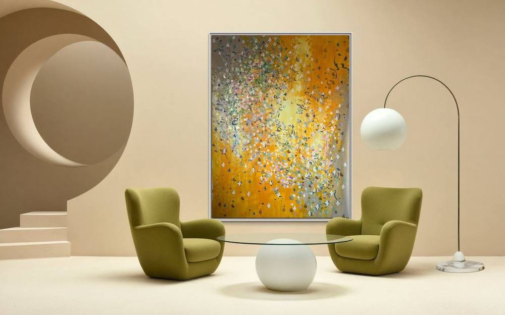
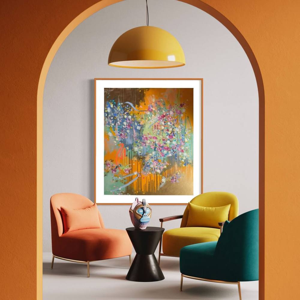
Pink in art: from Madame de Pompadour to contemporary painting
Pink has been the colour of a royal court, a porcelain manufactory, a couturière and a famous nude. A short history of the colour, leading to the paintings of Juliane Golbs.
Pink in art is often taken for the colour of sweetness. Its history is far less settled. At the court of Louis XV it was the colour of a powerful woman, at the Sèvres manufactory a technical achievement, in 1930s Paris a provocation. Anyone standing in front of a large pink painting today is looking at a colour that has been reinterpreted again and again.
Boucher paints Madame de Pompadour
In 1759 François Boucher painted his last portrait of the Marquise de Pompadour. The canvas in the Wallace Collection in London measures 91 × 68 centimetres and shows the mistress of Louis XV in a sumptuous pink gown. The museum explains how Boucher painted the silk: over a grey underlayer he laid a thin pink wash, which gives the taffeta its silvery cast. Pompadour, the description says, stands “like a living rose”.
The background matters just as much. She stands against the dark green trellis of a grove that recalls her park at Bellevue, with roses and orange blossom as emblems of love. Pink and green, flower and foliage, form a pairing here that has never quite left painting. Boucher had completed his first portrait of her by March 1750, and according to the Wallace Collection her patronage made him the leading decorative painter of his day.
Sèvres: pink and apple green on porcelain
At almost the same moment a new ground colour appeared at the porcelain manufactory of Sèvres. The Victoria and Albert Museum holds a saucer of 1757/58 on which pink and a pale apple green, “vert pomme”, are divided by gilt scrolls. According to the museum, the two colours were combined only for a short time around 1758. The support of the king and Madame de Pompadour, the V&A notes, allowed the factory to secure the best artists.
The Royal Collection Trust dates the introduction of the pink ground to the late 1750s and records that in England the colour was already being called “rose Pompadour” in her honour, later also “rose Du Barry” after another of the king’s mistresses. The Walters Art Museum in Baltimore adds an important caveat: there is no evidence that either woman was associated with its invention. The famous name is a tribute rather than a statement of origin.
Fragonard and The Swing
Barely a decade later Jean-Honoré Fragonard painted what may be the best-known pink dress of the Rococo. Les Hazards heureux de l’escarpolette, usually called The Swing, dates from around 1767/68 and also hangs in the Wallace Collection, where it measures 81 × 64.2 centimetres. The museum describes “a lovely pink silk frock”: the young woman flies through the air between her elderly husband and her young lover, losing a slipper on the way.
The pink of the silk is the brightest point in the picture, and the whole scene is arranged around it. For the history of the Rococo, then, pink is no minor colour. It is the colour in which the taste of an entire period is concentrated.
Pink for boys, blue for girls
That pink now counts as a colour for girls is a recent convention. Smithsonian Magazine quotes an American trade publication on children’s clothing from June 1918: the generally accepted rule, it said, was pink for the boy and blue for the girl, pink being regarded as the stronger colour. As late as 1927 Time printed a chart of leading American department stores, several of which advised pink for boys.
Pastels for babies, the same article explains, only became fashionable around the middle of the nineteenth century. The dress historian Jo B. Paoletti traced the development in her book Pink and Blue: Telling the Boys from the Girls in America. The picture was never uniform: the psychologist Marco Del Giudice found both today’s coding and its reverse in American newspapers and magazines from 1881 to 1930. For art this ambiguity is an advantage. Pink carries no fixed meaning; it acquires one in each new context.
Shocking Pink: Schiaparelli in Paris
In the 1930s pink acquired a new temperature. The couturière Elsa Schiaparelli, born in Rome in 1890 and died in Paris in 1973, launched a hot pink together with her perfume Shocking, according to the Metropolitan Museum of Art, and gave it the same name. The bottle was designed by the painter Leonor Fini. The Musée des Arts Décoratifs in Paris dates it to 1937 and names Fernand Guéry-Colas as co-designer.
The colour itself came from painting. According to the Met it was inspired by the palette of a painting by Pavel Tchelitchew. Schiaparelli worked with artists such as Leonor Fini and Salvador Dalí, and Dalí’s décor for her premises on the Place Vendôme included a Shocking Pink version of his Mae West lips sofa. Here pink was no longer a delicate tone. It was a signal sent by fashion and fine art together.
Matisse: the pink nude in 22 photographs
At around the same time Henri Matisse was working on a picture that has been exhibited as Pink Nude and Nu rose. The Baltimore Museum of Art lists it as Large Reclining Nude, dated 1934 and signed 1935, oil on canvas, 66.4 × 93.3 centimetres. Over six months Matisse reworked the composition again and again, and twenty-two photographs record its stages. He sent them in 1935 to his patron Etta Cone, who bought the finished painting in 1936.
The photographs show how hard the large pink expanse of the body was won. The pink is not a flesh tone in any naturalistic sense but an element of the picture that has to find its place in the composition. Today the painting belongs to the Cone Collection, formed in Baltimore by Claribel and Etta Cone.
Pink in art today: the paintings of Juliane Golbs
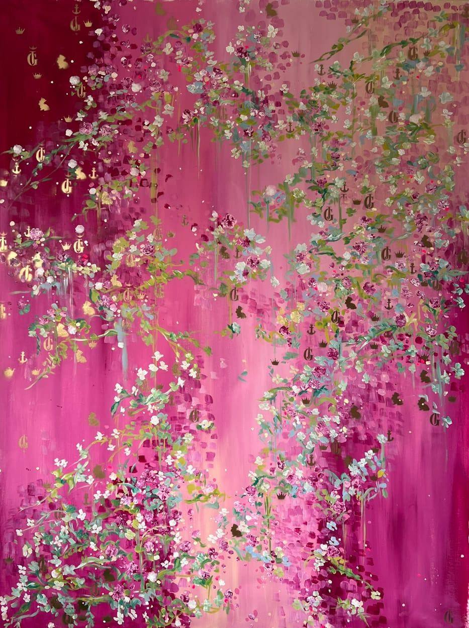
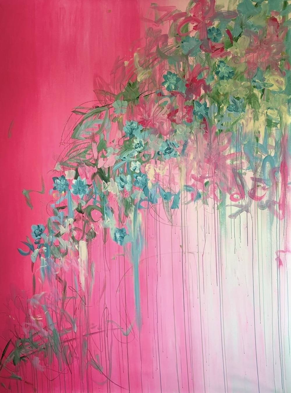
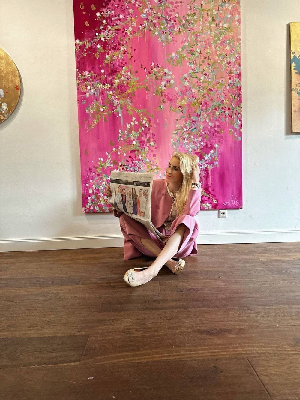
In the work of the Hamburg painter Juliane Golbs pink is one of the load-bearing colours. Numerous works in the catalogue carry the colour families pink or rosé, ranging from muted rose to saturated magenta. The large canvas 515 | 2024 from the Fifth Season series is built entirely on this colour: a ground of magenta, raspberry red and pale rosé runs downwards in fine streams. Above it spread branches with tiny white and old-rose blossoms, interspersed with gold monograms in gold lacquer.
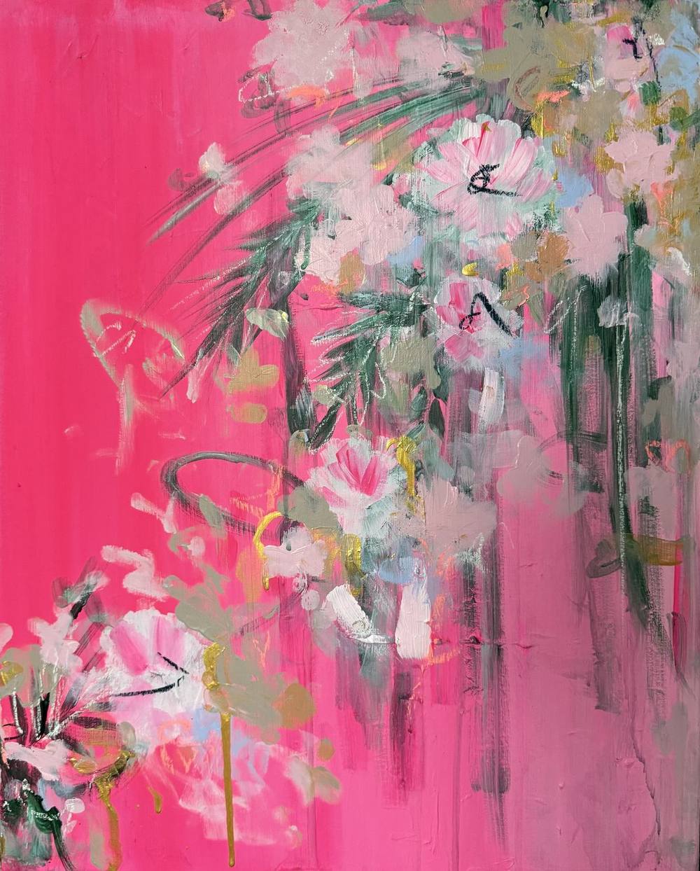
In 09 | 2026 from the series Fifth Season #heaven can wait the magenta runs from top to bottom through rosé into an almost white light. A tendril of turquoise and green blossoms descends diagonally across the canvas, while fine lines in coloured pencil suggest stems and the edges of leaves. The small 07 | 2026, 30 × 40 centimetres, shows the same colour at its most concentrated: strong pink right to the edges, with white blossoms and narrow dark green leaves in acrylic and chalk.
There is a gentler side too. 03 | 2026 layers rosé, peach and lemon yellow into a light-filled surface crossed by pencil lines. In Sunlight large blossoms in plum and magenta open between emerald ferns. That work is no longer available, but it remains one of the clearest examples in the series.
Pink, gold and green: an old harmony
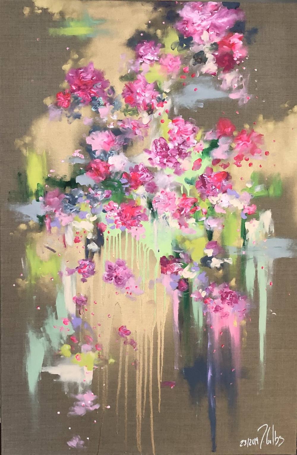
What stands out is how rarely pink appears on its own in Juliane Golbs’s work. Green almost always joins it, as moss green, fir green, mint or turquoise, and gold often follows. Without quoting anyone, her painting takes up a harmony already visible in Boucher and at Sèvres: pink against green foliage, pink beside apple green, framed in gold.
An early example is 23 | 2019 from the Everlasting Blossoms series. On raw, grey-brown linen, peonies in pink, magenta and old rose hover between touches of lime and mint, with passages of gold lacquer behind them. The bare linen takes every trace of sweetness out of the pink. Part of the proceeds from the series goes to the NCL Foundation.
Gold changes with the light. Gold lacquer and gold leaf respond to the angle of incidence: in raking light the accents in 515 | 2024 flare up while the matt ground stays calm. More on the material can be found in the article on gold leaf in painting.
Choosing a pink painting
When choosing a pink painting, the nuance comes first. A saturated magenta such as 515 | 2024 or 07 | 2026 creates a focal point and suits a light, quiet wall. A rosé such as 03 | 2026 opens a room rather than defining it. Wood, linen and stone frame both well, as the linen of 23 | 2019 already shows.
In the art advisor the colour world “Warm”, with gold, rosé and apricot, leads straight to these works, and the catalogue of works can also be filtered by colour. How pink fits into the long history of flower painting is the subject of the article on abstract floral painting. To see a work in person, the studio can be reached through the contact form.
Works from this article
Frequently asked questions
Where does the name “rose Pompadour” come from?
The name refers to Madame de Pompadour, mistress of Louis XV. The pink ground colour at Sèvres was introduced in the late 1750s. According to the Walters Art Museum, however, there is no evidence that she was involved in its invention.
Has pink always been a colour for girls?
No. According to Smithsonian Magazine, an American trade publication in 1918 still recommended pink for boys and blue for girls. More recent research shows the association was inconsistent for a long time.
What is Shocking Pink?
A vivid pink launched by Elsa Schiaparelli together with her perfume Shocking, whose bottle dates from 1937. According to the Metropolitan Museum of Art, the colour was inspired by the palette of a painting by Pavel Tchelitchew.
Which works by Juliane Golbs are pink?
Among others 515 | 2024 from the Fifth Season series, 09 | 2026 and 07 | 2026 from Fifth Season #heaven can wait, and 23 | 2019 from Everlasting Blossoms. The catalogue of works can be filtered by colour.
Sources
8 sources
- The Wallace Collection: François Boucher, Madame de Pompadour (1759)
- The Wallace Collection: Jean-Honoré Fragonard, Les Hazards heureux de l’escarpolette (The Swing)
- Victoria and Albert Museum: Soucoupe, Sèvres, 1757–58
- Royal Collection Trust: Pot-pourri gondole, Sèvres, 1757–58
- The Walters Art Museum: Sèvres vessel with pink ground, 1758
- Smithsonian Magazine: When Did Girls Start Wearing Pink?
- The Metropolitan Museum of Art, Leonard A. Lauder Research Center: Elsa Schiaparelli
- The Baltimore Museum of Art: Henri Matisse, Large Reclining Nude