Dining room art: format, hanging height and light above the table
At the dining table we sit for a long time, in fixed places and in changing light. Rules of thumb for size, hanging height and light, with landscape formats from Juliane Golbs’ catalogue of works.
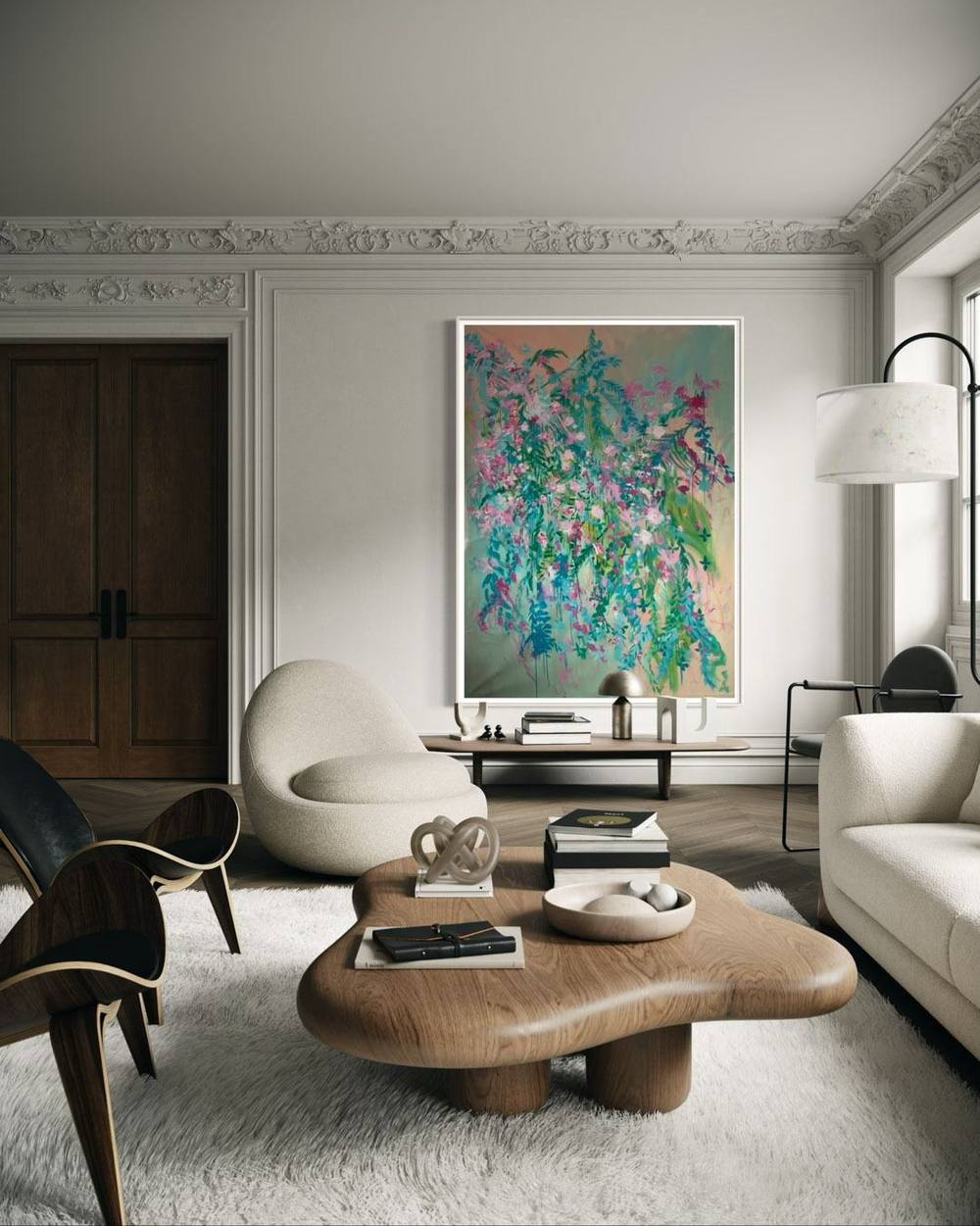
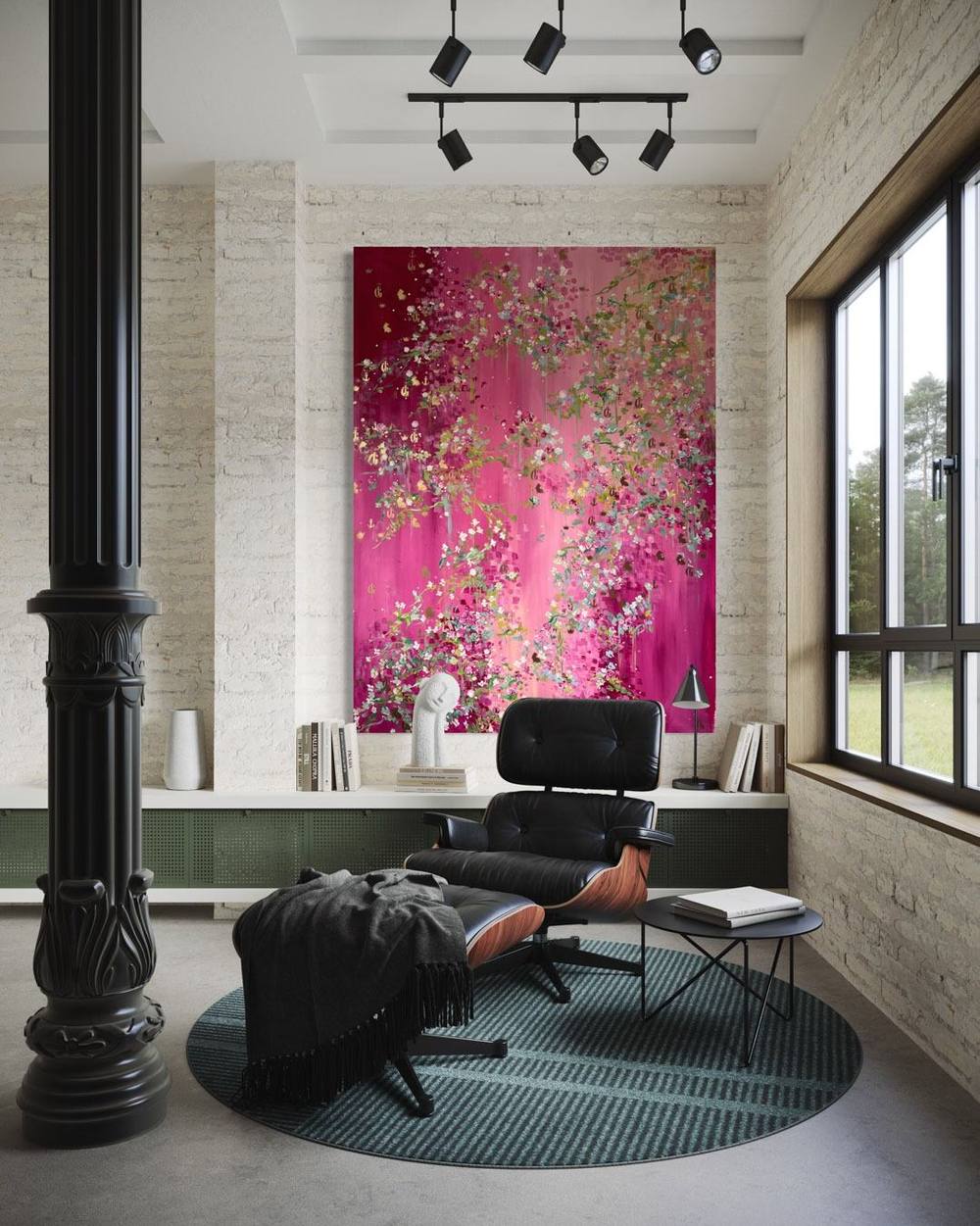
A painting in a dining room is met differently from one in any other room. We sit, often for an hour or more, in a fixed place. The gaze travels across plates, glasses and faces to the wall. Dining room art is therefore seen from a particular position, usually by several people at once and in light that changes from breakfast to a late supper. This article gathers rules of thumb for size, hanging height and light above the table. It also looks at warmth and the nearness of the kitchen, and closes with landscape formats from Juliane Golbs’ catalogue of works.
Dining room art: start from the table
In the living room the sofa is the point of reference, as the article on living room art describes. In the dining room the table takes over that role. It decides where people sit, how far away the wall is and which wall is actually seen. Anyone seated along the long side faces the opposite wall. Whoever sits at the head of the table looks at the end wall.
Before thinking about a particular work, it is worth looking at the seating plan. Often the wall in question is the one behind a long side, where a sideboard may also stand. Sometimes it is the end wall the host sees from their own chair. In a dining room you can hardly step back, either: the furniture fixes the distance between chair and wall. The painting has to hold its own from exactly there.
Size: table, wall and room
For the relationship between picture and furniture there is a widely used rule of thumb in interior advice. Artfully Walls describes it as art taking up about two thirds of the width of whatever sits beneath it. It names the sideboard in the dining room explicitly as a case in point. The 1stDibs guide adds a second limit: an arrangement should usually be no wider than the piece of furniture it hangs over.
Both rules can be carried over to the dining table. This is our own extension, not a standard. A painting above the dining table, on the wall behind it, looks settled when it is shorter than the tabletop, roughly between half and two thirds of its length. For a table of 2.40 metres that would mean a picture between 1.20 and 1.60 metres wide. Where the table stands free and there is no furniture against the wall, Artfully Walls suggests filling roughly 60 to 75 per cent of the wall section. When the wall dwarfs the furniture in front of it, the advice is to follow the furniture.
Ceiling height decides how tall the painting can be. There should be breathing space above and below, so the work does not look squeezed between ceiling and furniture. If you are considering a very large piece of dining room art, the article on large abstract paintings covers the basics.
Hanging height, seen from a chair
The best-known rule for hanging height comes from galleries. In Livingetc, the framing specialist Jason Wickens describes the 57-inch rule, which places the centre of a work 57 inches, around 145 centimetres, above the floor. 1stDibs gives average eye level as 57 to 60 inches, roughly 145 to 152 centimetres. Both figures assume a standing viewer.
In a dining room we sit. Wickens suggests hanging art a little lower in rooms where everyone is seated. According to 1stDibs, the interior designer Susana Simonpietri considers her clients’ head height when seated as she hangs work above a bench or sofa. From this follows a reasoned recommendation: in a dining room the centre of the painting may sit a little below the usual gallery height. If the painting hangs behind a row of chairs, the lower edge should stay high enough for heads and chair backs not to hide it.
Above a sideboard, the art adviser Kelly Cahn suggests in Livingetc a gap of about 15 to 30 centimetres between the top of the furniture and the lower edge of the frame. For every other case a simple test helps. Mark the outline of the painting on the wall with masking tape and sit down on several chairs in turn. Only then will you see whether the work reads well from every place.
Landscape, portrait, pair or triptych
A landscape format echoes the direction of the table. Above a long table it creates a calm horizontal that holds the room together, which is why landscape pieces are among the most frequent requests for dining room art. A portrait format suits narrow stretches of wall instead, between two windows or on the end wall facing the head of the table. With high ceilings it can open the room upwards.
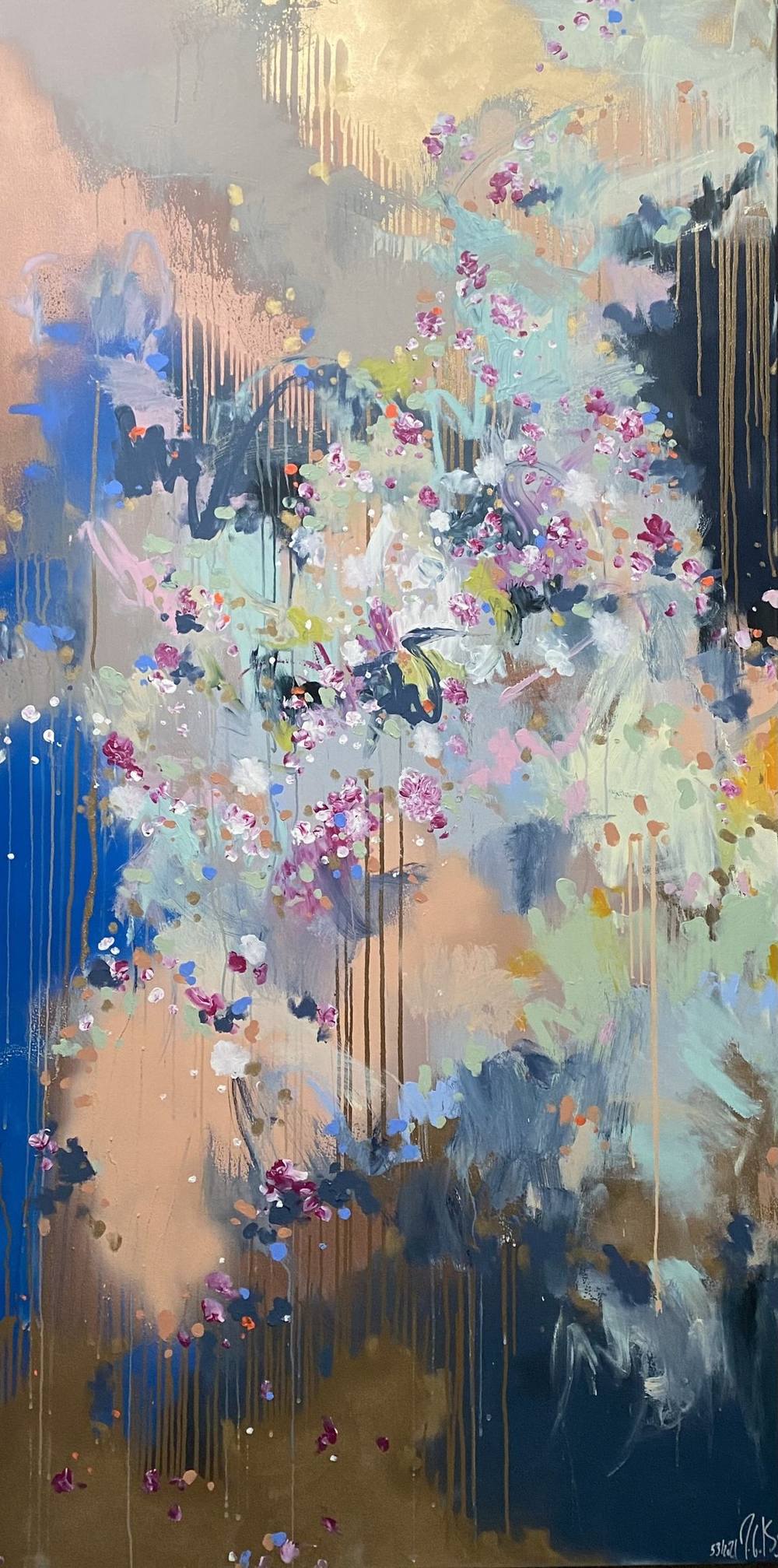
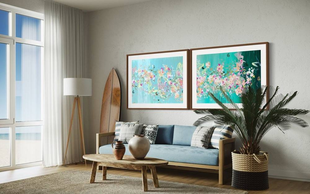
Two paintings of the same size can be hung as a pair, sharing a centre line with a narrow, even gap. In the catalogue, 06 | 2025 and 07 | 2025 lend themselves to this. Both measure 100 × 140 centimetres and belong to the series Fifth Season #heaven can wait. Their grounds of bronze lacquer and gold lacquer link them, while their colour chords of pink and sage on the one hand, yellow and green on the other keep them distinct. A three-part work is the most self-contained form; the history of the triptych and the three-part works of the Signature Collection are the subject of the article on the triptych.
Light: pendant, daylight and gloss
The pendant above the dining table lights the table, while the wall often stays in half-shadow. A painting therefore usually needs a second light source. In its guidelines for paintings the Canadian Conservation Institute prefers the cooler, more diffused light of floodlights to the heat and intense beam of spotlights. Picture lamps attached to frames are rarely successful, it notes, because they can overheat the painting. Incandescent lamps, according to the same source, should never be placed near a work.
Daylight is welcome at breakfast but a strain on an original. The Canadian Conservation Institute warns that highly sensitive paints can show UV damage within several months of exposure to unfiltered daylight. The Smithsonian Museum Conservation Institute advises against hanging paintings in direct sunlight. In a dining room, a wall the sun does not reach directly is the better choice.
Glossy surfaces need particular care. Many works by Juliane Golbs use gold lacquer, bronze lacquer, acrylic lacquers or gold leaf. Such surfaces mirror a light source. Seated, the eye meets the painting at a different angle than when standing. Check the gloss in the evening, with the pendant switched on and from your own seat. Moving a wall light slightly can be enough to remove a distracting patch of glare.
Colour and mood at the table
Many claims circulate about how colours affect appetite, and few of them hold up. It is more reliable to look at what is already on the table. Porcelain, wood, linen and flowers bring colours of their own. The painting enters into a relationship with them. A quiet, pale table can take a strongly coloured work, while a richly laid table gains from a picture with a clear ground colour.
Light changes colour too. In the evening, under warm artificial light, gold and warm tones come forward while cool colours recede. For rooms used mainly for dinner, dark grounds with gold work well. The curated text for 02 | 2023 names a dining room with subdued light as a possible setting. A breakfast room with plenty of daylight suits lighter, pastel works.
Modern abstract paintings have a practical advantage at the table: they do not steer the conversation. Everyone seated can see something different in them. Over many evenings the painting becomes familiar without wearing thin.
Warmth, steam and the nearby kitchen
The dining room is often next to the kitchen, and in many homes the two are one space. The Canadian Conservation Institute is clear on this point: kitchens and areas where cooking fumes or foodstuffs are present are not appropriate for displaying paintings. Nor does it recommend draughty spots or places near radiators, air vents and fireplaces. The Smithsonian Museum Conservation Institute specifically advises against hanging paintings over a fireplace, since heat dries out the material and speeds up natural ageing.
Exterior walls are a second risk. According to the Canadian Conservation Institute their inner surfaces can turn cold in winter, leaving unprotected works prone to condensation. The same institution notes that humidity problems in a room most often occur near heat sources such as sunny windows or radiators and near cold exterior walls. For acrylic paintings it adds that they are particularly susceptible to cracking in the cold.
Cleaning calls for its own caution. The Getty Conservation Institute explains that dirt can become tenaciously adhered to acrylic surfaces and that even dried, aged acrylic paints can be very sensitive to water-based cleaning solutions. A damp cloth is therefore not the answer. In an open-plan layout the original belongs on the wall furthest from the hob, away from radiator and extractor. Soiling is a job for a conservator, never for the kitchen sponge.
Ideas from the catalogue: landscape formats for the dining room
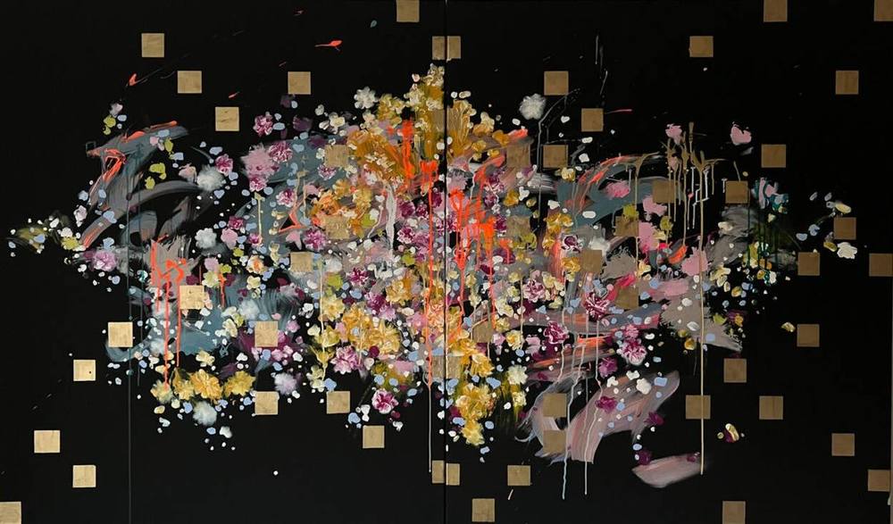
The most elongated of the available landscape formats in the catalogue is 02 | 2023 from the series Everlasting Blossoms. Across 200 × 120 centimetres of black canvas, a cloud of blossoms, splashes and lines in gold, ochre, pink and coral spreads out, surrounded by small golden squares. By the two-thirds rule of thumb, this width suits a table of about three metres. Part of the proceeds from the series goes to the NCL Foundation.
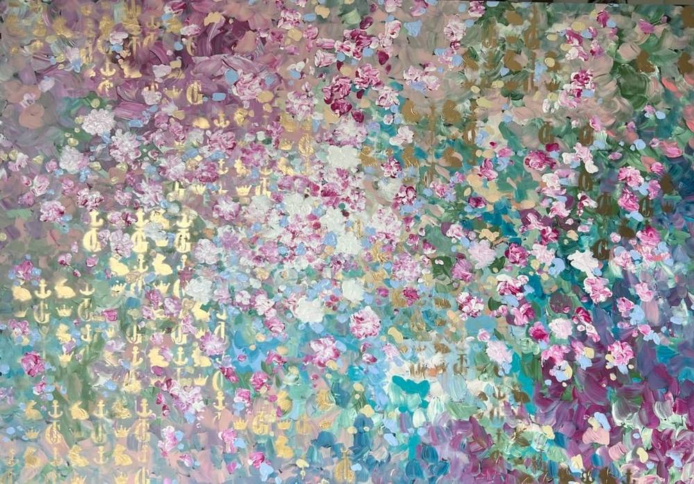
Calmer in effect is 501 | 2024 from the series Fifth Season. On a painting board of 140 × 100 centimetres, a carpet of blossoms in magenta, rosé and white lies over fields of turquoise and sage. On the left, monograms, anchors, crowns and hares shimmer in gold lacquer. The picture has no centre; the eye travels across its width. Above a sideboard or a table of medium length it forms a coloured horizontal.
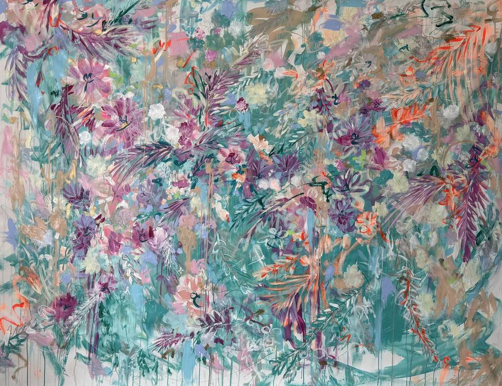
For tall rooms with a generous wall there is 05 | 2026 from the series Fifth Season #heaven can wait. At 200 × 150 centimetres it is both wide and tall, an overgrown garden of violet, old rose and turquoise crossed by red pencil lines. A similar panorama was 24 | 2022, also 200 × 150 centimetres, a cloud of blossoms between night blue and a golden ground, which is now in a private collection.
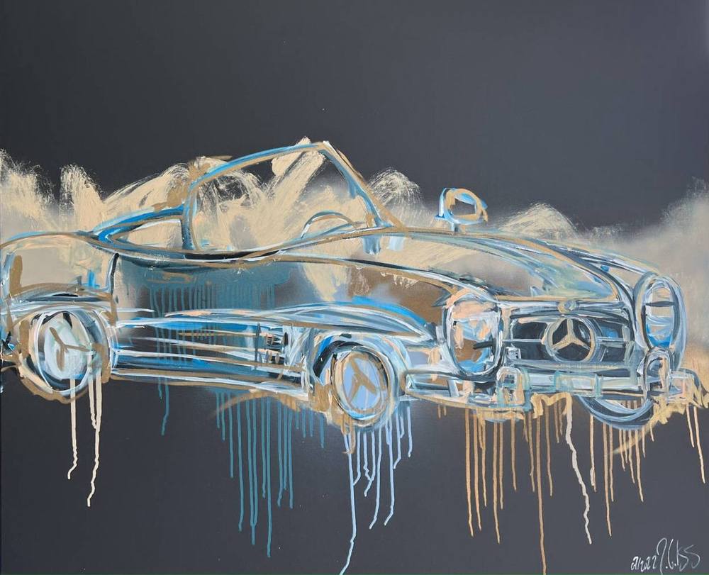
More compact is 07 | 2022 from the series Golden Things. On black canvas of 120 × 100 centimetres, pale blue and golden lines draw a classic roadster with a golden cloud rising behind it. The format suits a smaller dining room or a narrow table set against the wall.
Before deciding: scale comparison and trial hanging
Dimensions alone say little about how a painting will feel in your own room. Every work page in the catalogue of works therefore shows a scale comparison with a door, a sideboard and an armchair. The art adviser asks about mood and format and suggests suitable originals. Both make it easy to find the landscape formats.
If you would like to be certain, a work can be hung on trial for a small fee, which is credited against the purchase. In a dining room this is especially revealing, because only at dinner do you see how gold and lacquer respond to the pendant light. Enquiries about individual works reach the studio through the contact form.
Works from this article
Frequently asked questions
How large should a painting above a dining table be?
A common rule of thumb in interior advice is that a picture should take up about two thirds of the width of the furniture beneath it, such as a sideboard. Applied to a dining table, that means no wider than the table and ideally between half and two thirds of its length. It is a guide, not a standard.
How high should art hang in a dining room?
Galleries often place the centre of a picture at around 145 centimetres, a height meant for standing viewers. In a dining room the painting is usually seen from a chair, so it may hang a little lower. The most reliable test is an outline in masking tape, checked from several seats.
Can an original painting hang in an open-plan kitchen?
The Canadian Conservation Institute advises against displaying paintings in kitchens or areas with cooking fumes, and also near radiators, air vents or fireplaces. In an open-plan layout the painting should hang on the wall furthest from the hob.
Landscape or portrait format above the dining table?
A landscape format follows the length of the table and looks calm above a long table. A portrait format suits narrow stretches of wall, for example between two windows or on the end wall facing the head of the table.
Which works by Juliane Golbs suit a dining room in landscape format?
Available works include 02 | 2023 at 200 × 120 centimetres, 05 | 2026 at 200 × 150 centimetres, 501 | 2024 at 140 × 100 centimetres and 07 | 2022 at 120 × 100 centimetres. Every work page shows a scale comparison.
Sources
8 sources
- Artfully Walls: The 2/3 Rule for Wall Art
- 1stDibs: How to Arrange Wall Art. The Complete Art Placement Guide
- Livingetc: How high to hang art above furniture
- Canadian Conservation Institute: Storage and Display Guidelines for Paintings (CCI Notes 10/3)
- Canadian Conservation Institute: Environmental Guidelines for Paintings (CCI Notes 10/4)
- Canadian Conservation Institute: Agent of Deterioration. Incorrect Relative Humidity
- Smithsonian Museum Conservation Institute: Caring for Your Paintings
- Getty Conservation Institute: Cleaning of Acrylic Painted Surfaces