The colour green in art: from verdigris and poison green to the meadows of today
Few colours gave painters as much trouble as green. A short history from verdigris and Schweinfurt green to Monet's garden and the meadows of Juliane Golbs.
Green is the colour that surrounds us outdoors, and yet it is the one that gave painters trouble for longest. Anyone who looks closely at the colour green in art soon finds themselves in chemistry: pigments that darkened, that reacted with their neighbours on the palette, or that were simply poisonous. The history of green in painting is therefore also a history of compromise. It runs from the green earth of antiquity to the meadows and tendrils that Juliane Golbs paints in Hamburg today.
Earth and stone: the first greens
The oldest green paints came out of the ground. According to the pigment database ColourLex, green earth is a natural pigment of rather dull colour, prepared from the minerals glauconite or celadonite. It has been in use from antiquity to the present. Malachite, a basic copper carbonate, was one of the few green pigments available to painters right up to the nineteenth century. The Getty describes how the ancient Egyptians ground the stone to powder and mixed it with oil or animal fat.
Green earth had a particular task that is often invisible today. In Duccio's Virgin and Child of around 1312 to 1315, the skin and flesh tones were first laid in with green earth and then painted over in pink and white. The upper layers have faded with age, so the green now shows more strongly than was ever intended. Here green lay beneath the skin, as shadow and as a counterpoint to the pink.
Verdigris: beautiful and unreliable
The most brilliant green of the Old Masters was verdigris. It forms when copper comes into contact with acetic acid vapour, water vapour and air; the crust was scraped off and ground with a binder. ColourLex calls it the most intense green of its time and records it in Jan van Eyck's Arnolfini Portrait of 1434, in Rogier van der Weyden's Magdalen Reading and in Raphael's Saint John the Baptist Preaching of around 1505. The Getty notes that Leonardo da Vinci prized it for its brilliant blue-green shade.
That beauty came at a price. ColourLex describes verdigris as not very stable. It also darkens when mixed with sulphur-containing pigments such as ultramarine or orpiment. Dissolved in warm turpentine resin with mastic and wax, it produced transparent glazes known as copper resinates. Even freshly prepared, verdigris paint shifts from blue-green to green over roughly a month, according to ColourLex. Painting with it always meant working on trust.
Poison green: Scheele and Schweinfurt
In the eighteenth century chemistry went looking for a better green and found a dangerous one. In 1775 the Swedish chemist Carl Wilhelm Scheele invented a green made from copper arsenite. According to the Getty, he soon learned that it darkened with time. Schweinfurt green followed in 1814: the Neue Deutsche Biographie lists it under that year among the achievements of the Schweinfurt manufacturer Wilhelm Sattler. ColourLex gives emerald green, Paris green and Schweinfurt green as names for the same pigment, a copper acetoarsenite. Its colour, the database says, is "bright and beautiful but it is exceedingly poisonous".
Painters used it all the same. The Getty names J. M. W. Turner and Édouard Manet; ColourLex lists works by Paul Gauguin and Vincent van Gogh. The consequences were greater still on wallpaper. According to the Saint Louis Art Museum, it was only in the late 1860s that doctors linked illnesses and deaths, including those of small children, to luminous green papers on the walls. William Morris dismissed the warnings as a hoax invented by doctors, yet in the 1870s he bowed to public pressure and began producing arsenic-free wallpapers. Production of the pigment itself, ColourLex notes, ended only in the second half of the twentieth century.
Goethe and the green on which the eye rests
Four years before Schweinfurt green, in 1810, Goethe published Zur Farbenlehre, his Theory of Colours. In the section on the sensory and moral effect of colour, he describes green as a mixture of yellow and blue in which "our eye" finds "real satisfaction". When the two parent colours are in exact balance, he writes, eye and mind rest on the mixture as if it were something simple. He puts it in one short sentence: "One does not want to go further, and one cannot go further."
Goethe drew a very practical conclusion. For rooms in which one constantly lives, he observes, green is usually chosen for the wallpaper. A few decades later, green wallpapers fell into disrepute precisely because their green could contain arsenic. Goethe was writing about seeing, not about pigments. There is no need to turn his sentence into a rule about the effect of colour; as the observation of a careful looker, it still holds.
The colour green in art: viridian and Impressionism
Only in the nineteenth century did painting gain a green that was both brilliant and lasting. Viridian, a hydrated chromium oxide of vivid, slightly bluish colour, was first prepared by Pannetier in Paris around 1838 and patented by the French chemist Guignet in 1859, according to ColourLex. The anhydrous form, chromium oxide green, is duller and leans towards olive. The Impressionists used viridian frequently. Renoir is recorded as mixing it with chrome yellow and lead white for the green rushes in a foreground.
With the new material, green could become the subject of an entire picture. Claude Monet moved to Giverny in 1883 and in early 1893 acquired a swampy plot across the railway tracks, which he shaped into his water garden. The National Gallery of Art in Washington describes his Japanese Footbridge of 1899 as a picture of the arching blue-green bridge and the water garden, whose "impenetrable green enclosure" recalls the medieval hortus conclusus, the closed garden. Monet had designed and built the landscape he painted. Green was no longer the background. It was the space in which the picture took place.
Green in the work of Juliane Golbs: meadows, tendrils, foliage
In the floral works of Juliane Golbs, green is rarely a single colour. It is a spectrum that runs from olive gold to petrol. It carries the blossoms rather than disappearing behind them. This is clearest in the series Fifth Season and Fifth Season #heaven can wait, which speak of lived time and the light of the present.
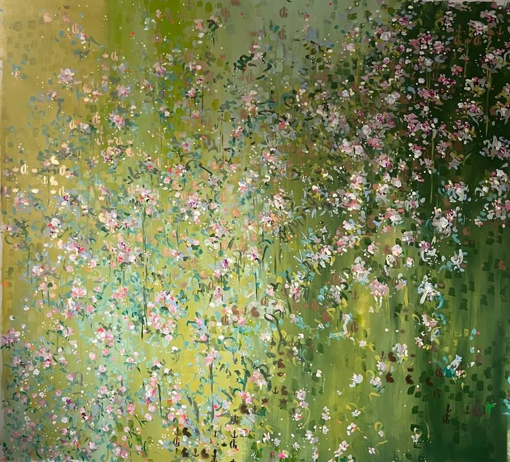
507 | 2024 from the Fifth Season series is a meadow in a square of 200 × 200 centimetres. The ground darkens from pale olive gold on the left to deep moss green on the right, and hundreds of small blossoms stand upon it in short, dabbing strokes. Only up close do the JG monogram, small anchors, crowns and hares appear. The smaller 503 | 2024, at 80 × 80 centimetres, lives on the transition between a light yellow-green and a rich meadow green; in gold lacquer, monogram and crowns shimmer like watermarks.
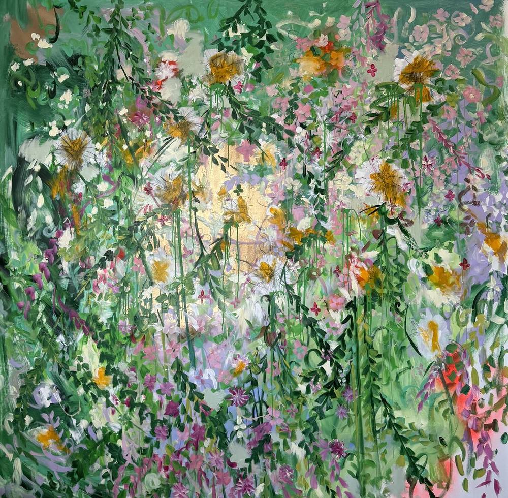
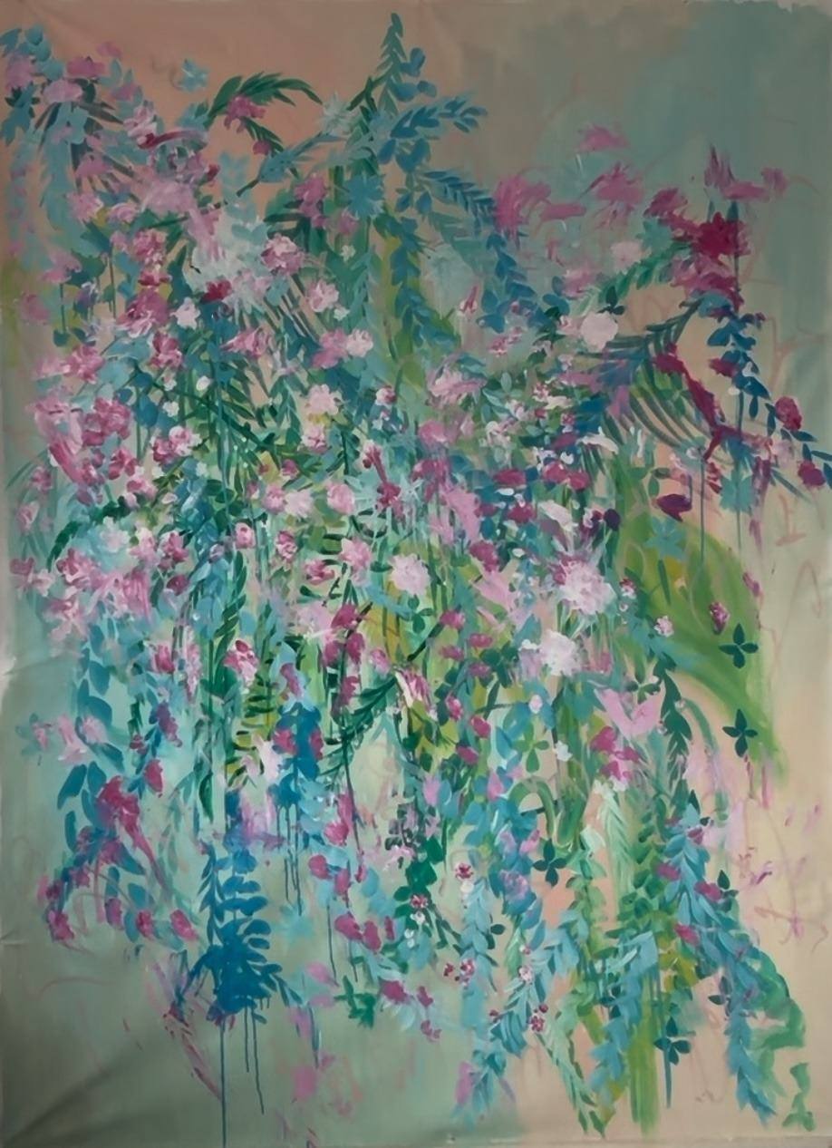
In Fifth Season #heaven can wait, the green becomes more animated. Across two metres by two, 04 | 2025 unfolds a meadow of grasses and tendrils in sage and fir green, scattered with marguerites and sweet peas. At its centre a clearing opens where the gold lacquer emerges from behind the green. 05 | 2025 lets a curtain of foliage fall into the picture from above, over a warm, cardboard-brown ground that gives the green its depth.
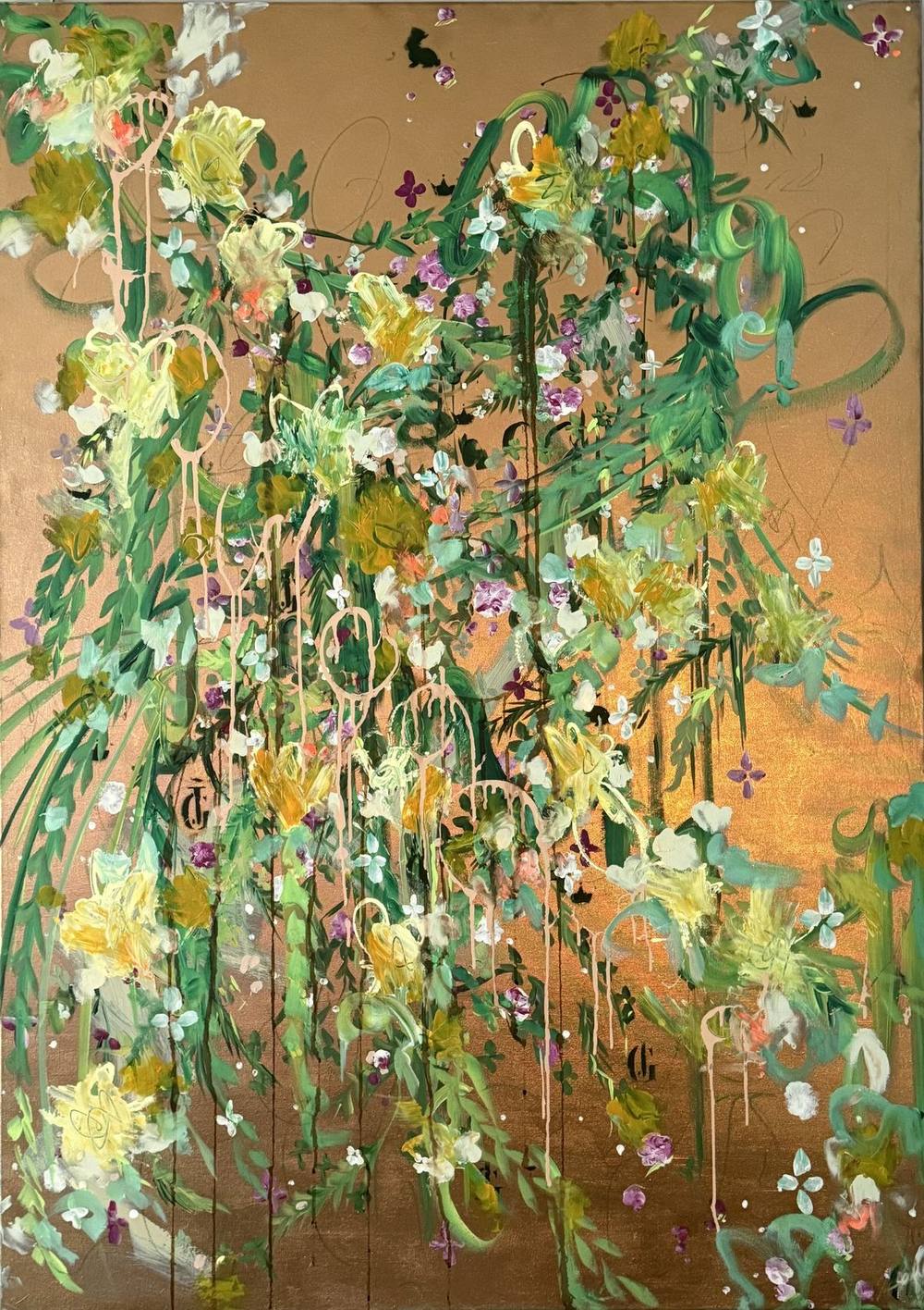
01 | 2025 shows a hanging garden: tendrils in petrol and emerald fall from the upper edge against a soft gradient of peach, sand and sage. In 07 | 2025 the green ribbons are set down in quick strokes that seem almost written, against a ground of gold lacquer and warm copper. There the green reads like foliage in evening light. 06 | 2025, too, pairs sage and fir green with a metallic, warm ground of bronze lacquer.
Two things stand out in these works. The green is almost never alone: it meets gold, copper or bronze, which glow behind the foliage like sunlight. And Juliane Golbs applies many of the layers with her fingers, so that green remains visible as a trace: as a dab, a run, a stroke. How this pictorial language grew out of the history of flower painting is the subject of the article on abstract floral painting.
Green paintings in a room
A green painting behaves differently in a room from a pink or golden one. It takes up the green outside the window and continues the plants inside. Cool greens such as petrol and emerald suit pale, calm walls; warm olive and moss greens sit well with wood, linen and brass.
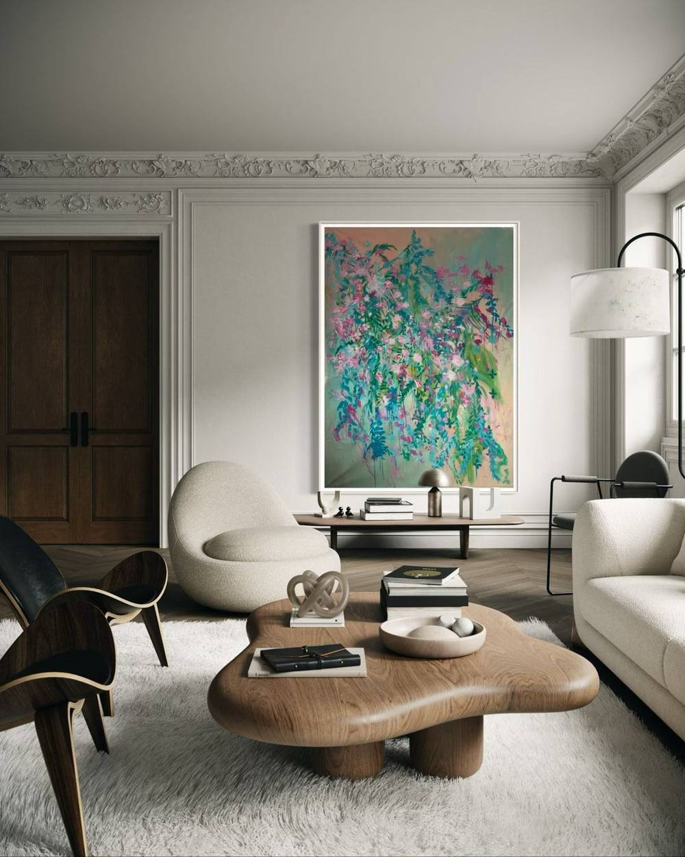
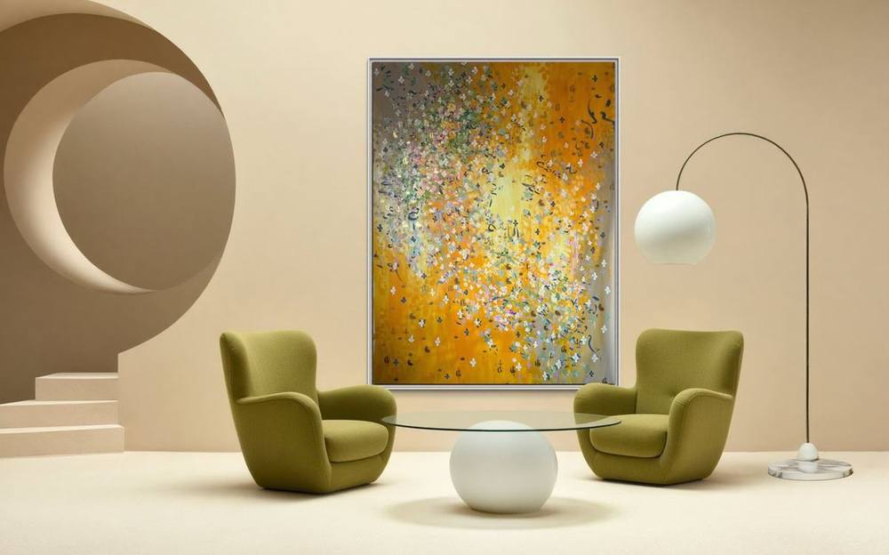
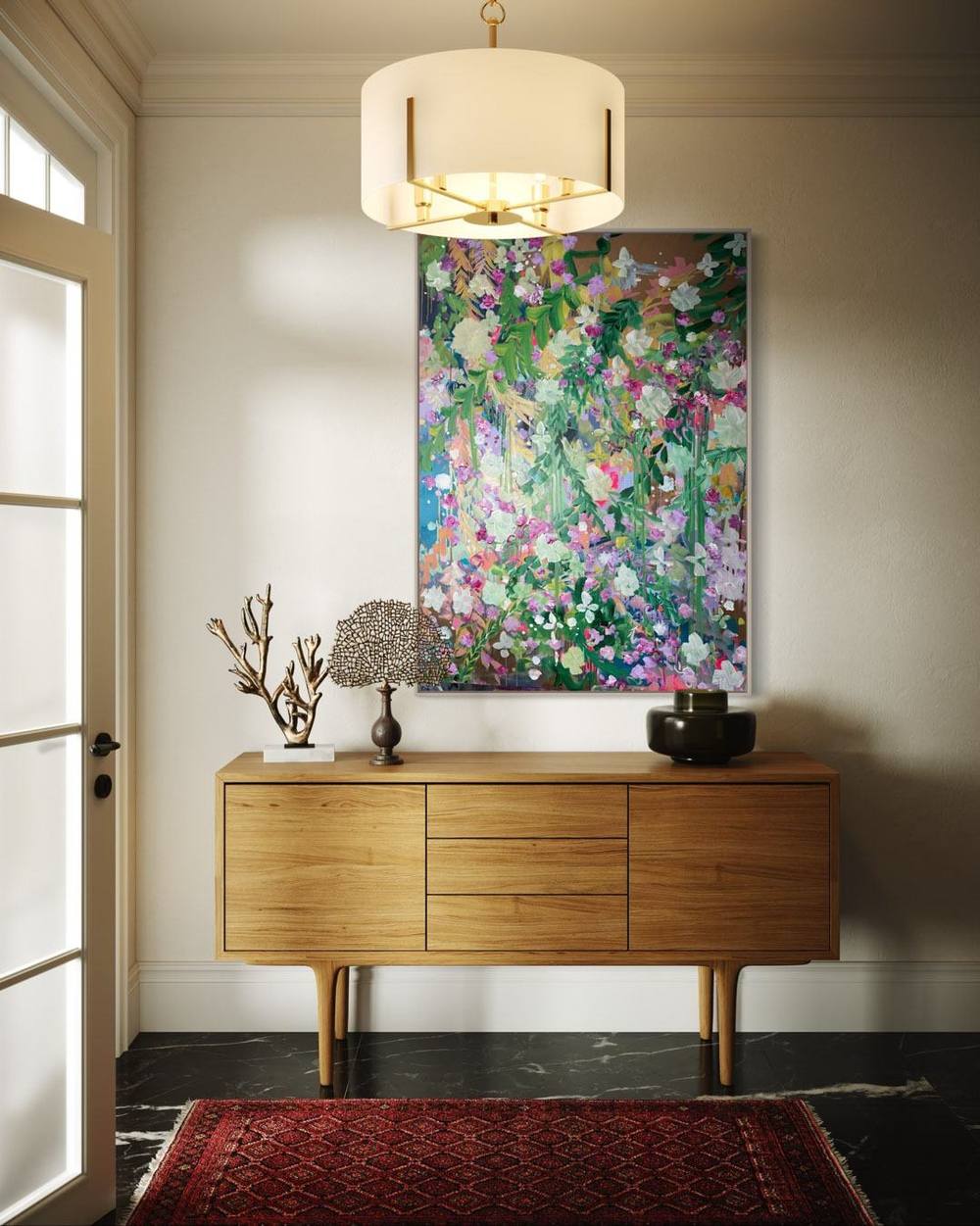
Size matters too. Large formats such as 04 | 2025 or 507 | 2024 act like a wall opened onto a garden and need room to step back. A format like 503 | 2024 can be viewed from a middle distance, above a chest of drawers or in a study. In an entrance hall, a green portrait format greets every guest with a first glimpse of the outdoors.
In the catalogue of works, every painting can be filtered by the colour green. The art advisor asks about colour world, mood and format directly. If you would like to see an original up close, you can reach the artist through the contact form.
For centuries painters had to choose between a green that glowed and a green that lasted. Today green may simply grow, across whole canvases, from olive gold to petrol.
Works from this article
Frequently asked questions
Which green pigments did the Old Masters use?
Chiefly green earth, malachite and verdigris. Green earth is a natural, rather dull pigment made from the minerals glauconite or celadonite. Malachite is a basic copper carbonate; verdigris is a group of copper acetates that can darken when mixed with sulphur-containing pigments.
What is Schweinfurt green?
A copper acetoarsenite that appeared in Schweinfurt in 1814 and is also known as emerald green or Paris green. Its colour was brilliant, but it was highly toxic, and production was discontinued in the second half of the twentieth century because of its toxicity.
What did Goethe write about green?
In his Theory of Colours of 1810, Goethe describes green as a mixture of yellow and blue in which the eye finds "real satisfaction". From this he concludes that green is usually chosen as the wallpaper colour for rooms in which one constantly lives.
Which works by Juliane Golbs are especially green?
Above all works from the series Fifth Season and Fifth Season #heaven can wait, such as 04 | 2025, 507 | 2024, 503 | 2024, 01 | 2025, 05 | 2025 and 07 | 2025. In the catalogue of works, every painting can be filtered by the colour green.
Sources
8 sources
- ColourLex: Timeline for Green Pigments
- ColourLex: Verdigris
- ColourLex: Green Earth
- ColourLex: Viridian
- Getty: Green Springs Eternal. The History of Green
- Saint Louis Art Museum: Arsenic in Victorian Wallpaper
- Goethe, Zur Farbenlehre, §§ 801–802 (textlog.de)
- National Gallery of Art, Washington: Claude Monet, Japanese Footbridge (1899)