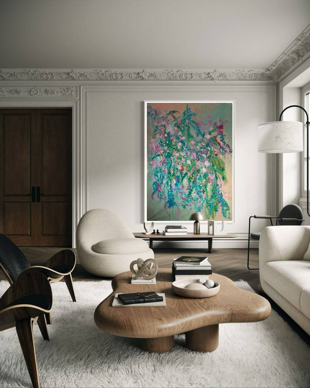
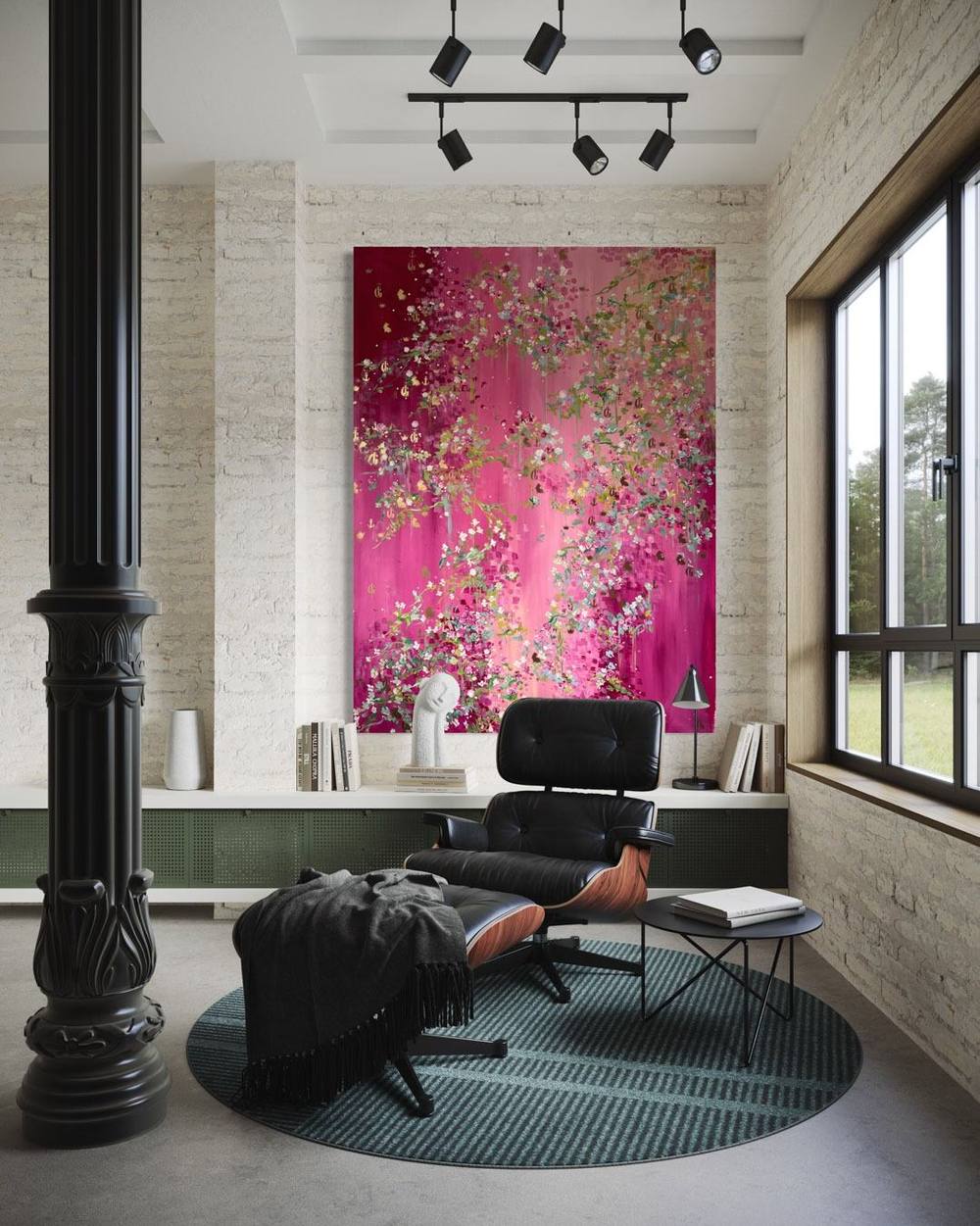
Bedroom art: the painting above the bed, light and calm
The bedroom is where you see a painting last thing at night and first thing in the morning. How wide the art above the bed may be, how to hang it safely and which light suits it.
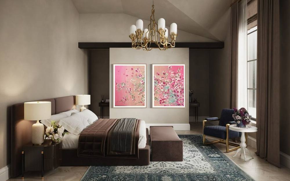
The bedroom is the room in which art is most often seen in half-light. The painting on the wall is the last thing you see in the evening beneath the reading lamp, and the first thing in the grey light from the window. Bedroom art therefore asks for a different choice from art for the living room, where guests sit and conversations happen. This guide covers the art above the bed, hanging it safely, light, and the question of which works suit a room meant for rest.
Art above the bed: width and spacing
In most bedrooms the wall above the headboard is the only large free surface. For its width there is a widely quoted rule of thumb, best treated as guidance rather than law: the picture should take up about two thirds of the width. Fine Art America recommends measuring the headboard, since frames and mattresses change the width of the bed, and never going below half. Saatchi Art gives a range of two thirds to three quarters of the headboard and names choosing too small a piece as the most common mistake.
A quick calculation makes the rule tangible. With a headboard of 180 centimetres, two thirds to three quarters gives roughly 120 to 135 centimetres of picture width. With 200 centimetres it is about 133 to 150. A landscape work such as 501 | 2024, at 140 × 100 centimetres, sits comfortably within that range for a wide double bed.
For height there is a second rule: measure from the headboard, not from the floor. Saatchi Art suggests 8 to 10 inches between the top of the headboard and the bottom edge of the picture, Fine Art America 8 to 12 inches, roughly 20 to 30 centimetres. Bed and painting then visibly belong together, while there is still room to lean back without knocking your head against the frame. How height is judged in other rooms is covered in the article on living room art.
Safety: what hangs over your head
Above the bed a picture hangs in the one place in the home where, if it falls, it lands on someone asleep. Fine Art America says so plainly and recommends lighter formats. Before choosing fixings you should know the weight of the work. Heavy frames with glass belong on a wall beneath which nobody lies, or they need particularly careful hanging.
Which fixing holds depends above all on the wall. In its guide to wall plugs, the German DIY retailer toom explains that every building material needs a different type: expansion plugs hold well in concrete or solid brick but poorly in plasterboard partitions and perforated blocks. Cavity walls have their own plugs, and the demands rise with the weight of the object. Fine Art America recommends two fixing points rather than one for art above the bed, and rigid hangers rather than wire, which can sag.
None of this replaces an inspection on site. If you do not know what your wall is made of, or you are planning a large original above the bed, it is worth calling in a professional, such as a joiner, a decorator or an experienced picture hanger.

Portrait, landscape or a pair
A bed is a wide, low piece of furniture. A landscape format repeats that horizontal and therefore looks especially natural above the headboard. In 501 | 2024 a carpet of small blossoms in magenta, rose and lilac spreads across the whole surface. The composition has no centre, so the eye travels across the width. That is exactly what suits it to a room where a painting is rarely seen head-on and often from the corner of the eye.
A portrait format above the bed needs more ceiling height. With a headboard 120 centimetres high, a gap of 25 centimetres and a work 200 centimetres tall, the top edge ends up at 345 centimetres. That is possible in a tall period flat but not in many newer buildings. In the bedroom, portrait formats often work better on the wall opposite the bed, where you see them lying down, or on a narrow stretch of wall beside the window.
A pair is a third option. Fine Art America recommends two pieces of the same size, 2 to 3 inches apart, about 5 to 8 centimetres, centred on the bed. For the width rule, both pictures and the gap count as one surface. The cover image of this article shows another solution: the pair hangs not above the headboard but on the back wall behind the bench. The bed stays clear and the paintings face it.
Calm bedroom art: composition and colour
Many guides promise that certain colours help you fall asleep. Reliable statements of that kind are hard to make about a single painting, so this article leaves them aside. What can be described with confidence is what makes a picture feel calm: a composition with a clear direction, a limited palette, soft transitions, few hard contrasts. A picture with many competing centres keeps the eye moving. A picture with one continuous movement lets it settle.
One example is 01 | 2025 from the series Fifth Season #heaven can wait. Tendrils in petrol and emerald hang down from the top edge, with blossoms in old rose, raspberry and white between them. The ground is a gradient of peach, sand and sage green. In the catalogue of works the piece is listed as calm, harmonious and poetic, and its text describes it as particularly calm and ordered within the series.

Calm is not a matter of brightness. 28 | 2022 from the Signature Collection stands on deep midnight blue. A grid of cream squares orders the surface, broad brushstrokes in ice blue and petrol run through it, and small pink blossoms sit on the points where they cross. The order of the grid gives this dark picture its composure. At 60 × 80 centimetres it suits a bedroom in cool tones or the narrow wall beside the door.
If you are looking for light, soft tones, the article on white in art shows works in which white defines the surface. On the way to the right picture it helps to ask less about a motif and more about the state you want the room to be in.
Light: reading lamps, daylight, UV
Light changes more in the bedroom than in other rooms. In the evening often only the bedside lamps are on. They should be angled onto the book rather than permanently onto the painting. With works that contain gold leaf or lacquer, an evening test is worthwhile: 37 | 2021 from the series Golden Things combines acrylic, gold lacquers and gold leaf, which according to its text respond to light in different ways. The gold leaf reflects hard and clear, the acrylic stays matt. A lamp to one side can make the gold glow or create a distracting reflection, depending on the angle.
Daylight is the most beautiful light for a painting and also the most demanding. The Canadian Conservation Institute lists daylight as a source with very high UV content. Window glass filters shortwave UV, but in the institute’s assessment not enough for museum standards. UV-filtering window films are one option, though the institute notes they may affect the warranty on sealed double glazing.
A second point from the institute matters even more. UV usually contributes less than half of the fading, often only a tenth. Visible light works on a picture too, and the institute defines the dose of light as intensity multiplied by time. For the bedroom this means direct sunlight should never fall on an original, not even for a few hours in the morning. A wall at the side of the window is usually a better choice than the wall facing a south-facing window.
Small formats on a chest of drawers or bedside
Not every bedroom needs a large painting. Often the lovelier place for an original is a chest of drawers, a writing desk or the wall beside the bedside table, where you come very close to it. Small formats have an intimacy there that a large picture seen from a distance lacks. You see the brushwork, the relief of the paint, the drips along the lower edge.
06 | 2026 measures 40 × 60 centimetres. White blossoms, thickly applied and roughened with chalk, stand among green palm fronds on a warm apricot ground. In the catalogue its moods include calm, poetic and light. The square 503 | 2024, at 80 × 80 centimetres, is also listed as calm, and its text describes it as a piece for rooms where it is seen from a middle distance, for example above a chest of drawers.
If you lean a small picture against the wall on a chest of drawers, secure it against slipping. The bedside table itself is rarely a good home for an original: glasses of water, creams and fumbling for the alarm in the dark do not sit well with a paint surface. The wall above or beside it is the safer place.

Large art in the bedroom
A large format can do a bedroom good as long as it remains the only picture in the room. Works of 150 × 200 centimetres such as 01 | 2025 then act like a second wall into which the eye can travel. For this to work the room needs distance: a large picture on the wall opposite the bed, seen from three or four metres, unfolds quite differently from the same picture above the headboard, which you hardly see when lying down. How large formats deal with a room in general is described in the article on large abstract paintings. If you are looking for art for other rooms, a guide to dining room art has been available since 18 November.
Before you decide: size comparison and art advisor
In the bedroom the effect of a format is hard to predict, because you see it from unusual positions: lying down, sitting on the edge of the bed, in half-light. Every work page by Juliane Golbs therefore shows a size comparison to scale next to a door two metres high, a sideboard and an armchair. A bed is not shown, but the door gives a reliable height for reference.
It helps to mark the intended area above the bed with paper or masking tape and live with it for a few evenings. The art advisor leads in four steps through colour, format, mood and budget to the available originals that suit your wall. In the catalogue of works the “Quiet works” path gathers contemplative pieces for still rooms. For questions about hanging, or about trying a work in your own room, please use the contact page.
Works from this article

Frequently asked questions
How wide should art above the bed be?
A common rule of thumb is about two thirds of the width, measured at the headboard, with two thirds to three quarters as a range. Fine Art America advises never going below half. With a headboard of 180 centimetres that means roughly 120 to 135 centimetres of picture width.
How high should art hang above the bed?
Measure from the headboard, not from the floor. Saatchi Art suggests about 8 to 10 inches, Fine Art America 8 to 12 inches between the top of the headboard and the bottom of the picture, roughly 20 to 30 centimetres.
Is a heavy picture above the bed dangerous?
A picture that comes loose there falls on someone asleep. That is why weight, hanging hardware and wall fixings deserve particular care above the bed. If in doubt about what your wall will hold, ask a professional.
Does window glass protect a painting from fading?
Only partly. According to the Canadian Conservation Institute, window glass filters shortwave UV, but not enough for museum standards. UV also usually causes less than half of the fading, as visible light contributes too. Direct sunlight on an original is best avoided.
Which works by Juliane Golbs suit a calm bedroom?
In the catalogue of works, 01 | 2025, 28 | 2022 and 37 | 2021 among others are listed as calm. The “Quiet works” path helps you find such pieces.