White in art: from lead white to the white canvas
For centuries white was a poisonous pigment, and in the twentieth century it became the colour of painting’s most radical pictures. A short history of white, leading to the white blossoms and lines of Juliane Golbs.
White in art has two histories. One is a history of material: for centuries painters worked with a white made from lead, which gave their pictures their brilliance and was poisonous at the same time. The other is a history of ideas. In the twentieth century a white square on a white ground became one of the defining images of modernism, and later an American painter made almost nothing but white paintings. Standing today in front of a picture with white blossoms or white lines, you are looking at both histories at once.
Lead white: the old masters’ white and its poison
According to the pigment database ColourLex, lead white consists mainly of basic lead carbonate. It has been in use since antiquity. In the fourth century BC Theophrastus already described how it was made: a piece of lead as big as a brick was placed above vinegar in a cask, and the white matter was scraped off again and again. Later methods followed the same principle. Strips of lead sat in porous earthenware pots above weak acetic acid, in sheds filled with fermenting manure that supplied heat and carbon dioxide. After a few months a white crust had formed, which was scraped off, dried and ground.
For oil painting the pigment was ideal. It dries quickly, because it speeds up the hardening of the oil. It is also unaffected by light. Painters used it, ColourLex notes, for grounds, for lightening other colours, for depicting light and as a white in its own right. Around 1514 Titian painted the loincloth in his Noli me Tangere with fluid lead white so that it would appear translucent. In 1634 Rembrandt used a very pure lead white for the ruff and cap in his Portrait of Aechje Claesdr.
ColourLex is plain about the drawback: lead white is highly toxic and should not be used by anyone not trained to handle it. Hydrogen sulphide in the air can also turn it into black lead sulphide. Even so, it remained the most important white pigment in painting until the end of the nineteenth century.
Zinc white: the white of the nineteenth century
The first serious alternative came from zinc. Zinc oxide had been known as a mineral since antiquity, but according to CAMEO, the materials database of the Museum of Fine Arts, Boston, it was rarely used as a pigment before 1834. In that year the colourmen Winsor & Newton listed zinc oxide as “Chinese white” for watercolour.
In oil the new white was at first weaker than lead white, as early batches covered and dried poorly. By the late nineteenth century, CAMEO writes, it had been improved enough to become a widely used alternative. CAMEO describes zinc white as permanent, opaque and non-toxic. ColourLex names Vincent van Gogh, Édouard Manet and Edvard Munch among the painters who used it.
Titanium white: the white of modernism
Titanium white is the youngest of the three great white pigments. According to CAMEO, the Titan Company A/S was founded in Norway in 1916, as was the Titanium Pigment Company in the United States, and they reached full production in 1918 and 1919. Pure anatase, one crystal form of titanium dioxide, went on sale in France in 1923. Rutile, with even better hiding power, was patented in 1931 and produced commercially from 1937.
Titanium dioxide has very high hiding power and is regarded as non-toxic. CAMEO attributes its rapid spread in the 1920s partly to the requirement in many countries to find an alternative to toxic lead white. An era came to an end: the white that had been made from lead and vinegar since antiquity gave way, in the twentieth century, to pigments made from zinc and titanium.
Whistler and the Symphony in White
Before modernism made white its subject, James McNeill Whistler painted a picture in which almost everything is white. His Symphony in White, No. 1: The White Girl at the National Gallery of Art in Washington is inscribed “Whistler. 1862” at upper right, and the museum dates it 1861 to 1863 and 1872. The oil on canvas measures 213 × 107.9 centimetres. It shows Joanna Hiffernan in a long white dress before a white curtain. In her left hand she holds a white lily, and her sleeves carry a striped pattern of white on white.
When the picture was shown in London in 1862, then titled “The Woman in White”, it puzzled viewers, according to the museum. A portrait on this scale usually depicted someone well known, while Hiffernan was an Irish immigrant with little standing in British society. In 1863 it hung in Paris at the Salon des Refusés. Whistler later grouped it with two further pictures of Hiffernan in white dresses under the shared title Symphony in White. Like music, he claimed, these works were solely about line and colour.
Malevich: White on White
Some fifty years later Kazimir Malevich took the final step. His Suprematist Composition: White on White of 1918 at the Museum of Modern Art in New York shows a white square on a white ground, 79.4 × 79.4 centimetres, oil on canvas. The square sits off centre and slightly askew, which gives the picture a sense of movement. It is only faintly distinguished from the somewhat warmer white of the ground.
For Malevich, MoMA explains, white was the colour of infinity, a link to a higher realm of pure form. In his manifesto he urged viewers to swim in the white free abyss, with infinity before them. Yet the painting remains entirely concrete: the delicate brushwork in the paint reveals the artist’s hand. Three years earlier he had shown the Black Square, whose story is told in the article on black in art. White on White is its luminous counterpart.
Robert Ryman: white paintings as a question of surface
For decades Robert Ryman painted white paintings. Beginning in 1953, MoMA notes, he worked for seven years as a guard at the Museum of Modern Art. The museum gave him an exhibition in 1993 and described how he generally limited himself to white paint and a square format. His supports ranged from cardboard and wax paper to fibreglass and cold-rolled steel. He put it this way: “My paintings don’t really exist unless they’re on the wall, as part of the wall, as part of the room.”
Classico 5 of 1968 shows what that means: acrylic on twelve sheets of off-white Classico paper, arranged in three rows of four, 236.9 × 224.8 centimetres overall. Ryman painted an off-centre white square across the grid. Once the paint had dried he removed the tape that joined the sheets, leaving unpainted marks at the corners. MoMA sums up his position: the purity of white best reveals how the paint has been handled.
White as ground: gesso and priming
Long before white became a subject, it lay beneath almost every picture. The National Gallery in London explains that gesso is the Italian word for the white mineral gypsum. The term refers to a white base layer of gypsum and animal glue, applied in a coarse coat and a fine coat and smoothed so that paint or gold leaf would hold well on wood. It was sometimes used on canvas too. North of the Alps, chalk usually took the place of gypsum.
With Ryman, the white that normally disappears beneath a picture becomes the picture itself. The work of Juliane Golbs contains a related gesture: some paintings leave the support open, so that the ground itself has a voice.
White in the art of Juliane Golbs
For the Hamburg painter Juliane Golbs, white is rarely a field and often a blossom or a line. In the catalogue of works, white is among the colours that appear in a great many paintings. It often lies thick and opaque on a coloured ground, where it reads like light falling on single flowers.
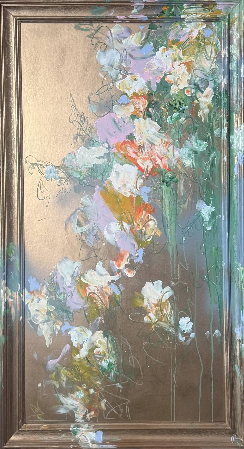
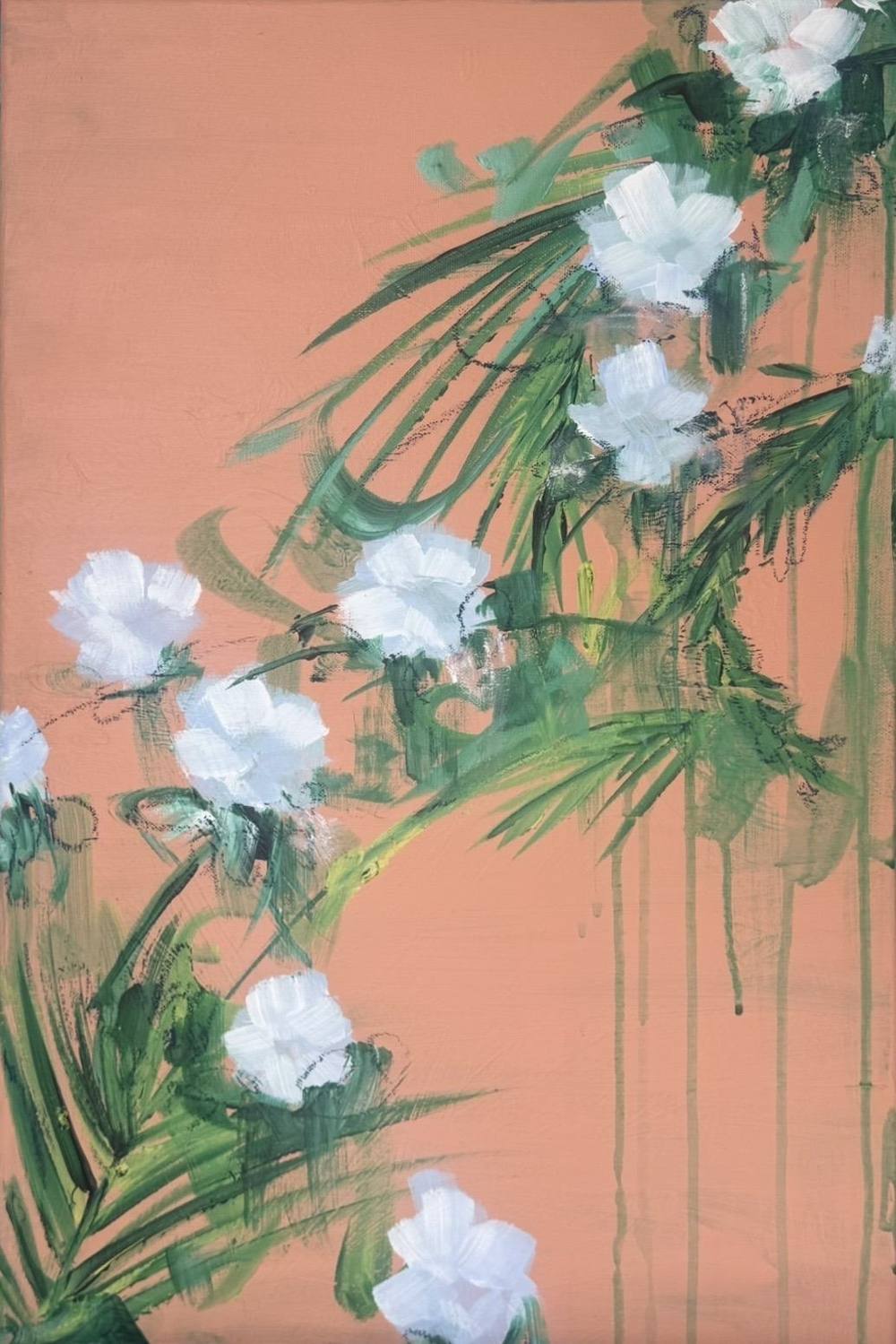
06 | 2026 from Fifth Season #heaven can wait shows this most clearly, a 40 × 60 centimetre upright format in acrylic and chalk. On a warm, evenly applied apricot ground, palm fronds push into the picture from the right, and among them stand white blossoms, thickly painted and roughened with chalk. The asymmetry recalls Japanese folding screens, where branches reach into empty space from the edge. Closely related is 01 | 2026, in which white, lavender and apricot blossoms grow across the frame before a ground of bronze and champagne.
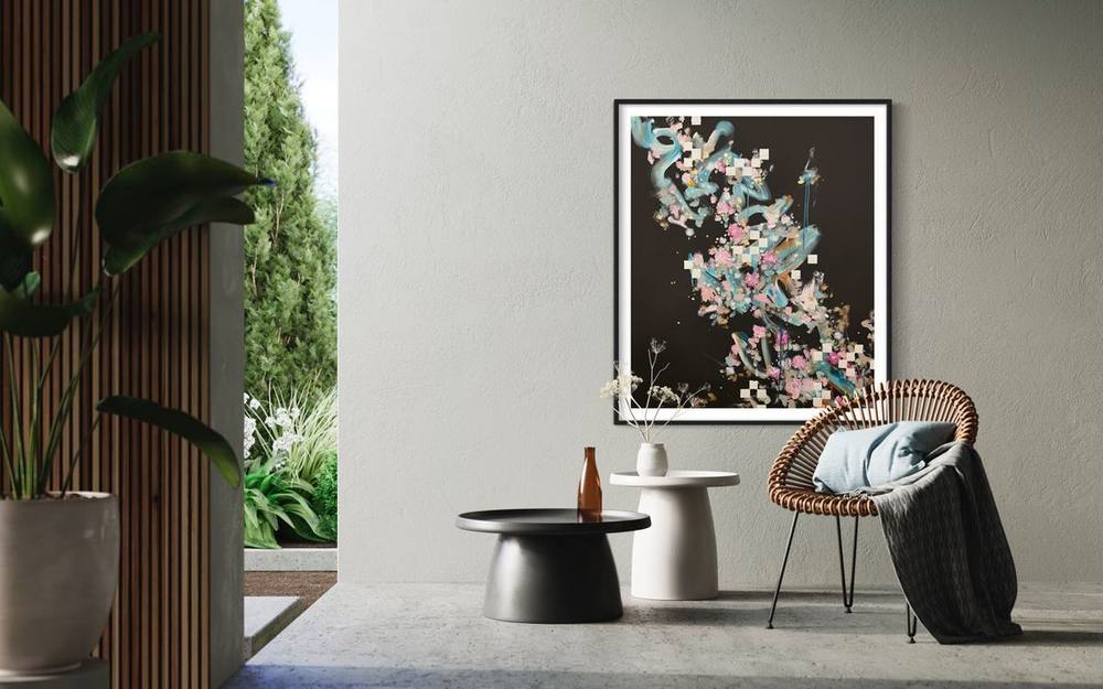
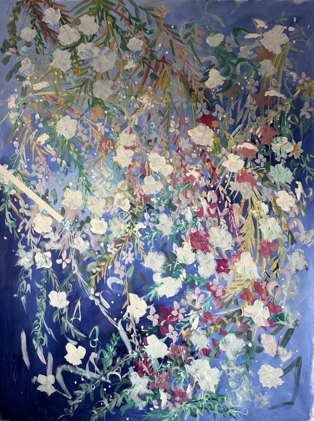
On a dark ground white changes character. In 02 | 2025 a cascade of grasses and branches falls across deep ultramarine, hung with white and cream blossoms and the occasional touch of burgundy and old rose. On the left a pale stroke crosses the picture like a beam of light. On a black field, as in 27 | 2022 from the Signature Collection, white dabs bloom beside rosé and lilac along a turquoise brushstroke.
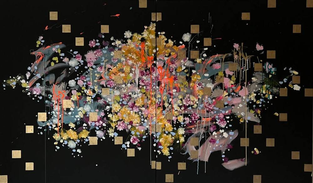
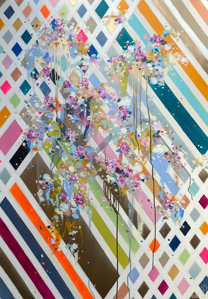
White can also create order in Juliane Golbs’s work. In 42 | 2021 a strict lattice of white diagonals divides the ground into diamonds and bands of petrol, orange, neon pink, midnight blue, olive and bronze. Over it falls a cascade of small blossoms in lilac, pale blue and white, and gold and bronze drips connect the two layers. In places gold leaf catches the raking light.
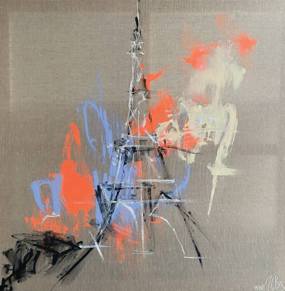
In 45 | 2021 white becomes pure drawing. On raw, greyish beige linen stands a tower construction, sketched in a few black and white lines, that brings the Eiffel Tower to mind. Around it, areas of neon orange, cornflower blue and cream burst outwards. The unpainted linen becomes the air in which the structure stands. As with Ryman, what the picture is painted on remains visible.
In the gardens of the most recent series, too, white carries the light. In 05 | 2025 white blossoms and violet vetches hang in a curtain of foliage, and in the small 07 | 2026 white and pale pink blossoms gather on vivid pink. How much floral painting relies on such points of light is the subject of the article on abstract floral painting.
Choosing a painting with white
White blossoms and lines respond strongly to light. In daylight they stand out clearly, and in the evening they take on the warmth of lamps. A light ground such as the apricot of 06 | 2026 makes the white appear soft, while a dark one such as the ultramarine of 02 | 2025 makes it more luminous. On a white wall the white in the painting joins the room, an idea Ryman also expressed.
The catalogue of works can be filtered by the colour white, and the art adviser asks about mood and format. How Juliane Golbs works with her principal medium is described in the article on acrylic on canvas. If you would like to see one of these paintings in the original, the studio can be reached through the contact form.
Works from this article
Frequently asked questions
Why is lead white toxic?
According to ColourLex, lead white consists mainly of basic lead carbonate. The database warns that the pigment is highly toxic and should not be used by anyone not trained to handle it. In the twentieth century it was replaced by less toxic white pigments such as zinc white and titanium white.
When did zinc white and titanium white appear?
According to CAMEO, the materials database of the Museum of Fine Arts, Boston, Winsor & Newton introduced zinc oxide as “Chinese white” for watercolour in 1834. For titanium white, companies were founded in Norway and the United States in 1916 and reached full production in 1918 and 1919.
What does Malevich’s White on White show?
The 1918 painting at the Museum of Modern Art shows a slightly tilted, off-centre white square on a somewhat warmer white ground. It measures 79.4 × 79.4 centimetres. According to MoMA, Malevich regarded white as the colour of infinity.
What is gesso?
According to the National Gallery in London, gesso is the Italian word for the white mineral gypsum. It refers to a white preparatory layer of gypsum and animal glue on which paint or gold leaf holds well on wood. North of the Alps, chalk was usually used instead of gypsum.
In which works by Juliane Golbs does white play a major role?
Among others in 06 | 2026 with white blossoms on apricot, 02 | 2025 with white blossoms on ultramarine, 42 | 2021 with a lattice of white diagonals and 45 | 2021 with white lines on raw linen. The catalogue of works can be filtered by colour.
Sources
8 sources
- ColourLex: Lead white
- CAMEO, Museum of Fine Arts Boston: Zinc white
- CAMEO, Museum of Fine Arts Boston: Titanium white
- National Gallery of Art, Washington: James McNeill Whistler, Symphony in White, No. 1: The White Girl
- The Museum of Modern Art: Kazimir Malevich, Suprematist Composition: White on White (1918)
- The Museum of Modern Art: Robert Ryman, Classico 5 (1968)
- The Museum of Modern Art: Robert Ryman exhibition (1993/94)
- The National Gallery, London: Glossary, Gesso