The colour blue in art: from lapis lazuli to Klein blue
Few colours stayed precious for as long as blue. A short history of blue pigments, from the workshops of ancient Egypt to the paintings of Juliane Golbs.
The colour blue in art has a history of its own, and much of it is a history of material. For a long time a luminous blue was hard to come by, costly and therefore reserved for particular passages of a picture. Each new way of making it changed who could paint with blue and for what purpose. Anyone looking at a blue painting today is also looking at that long prehistory.
Egyptian blue: a colour from the kiln
The story begins with a pigment that was made rather than found. Egyptian blue is a calcium copper silicate, produced by heating silica with a calcium compound, a copper compound and a flux. The Royal Society of Chemistry dates the earliest evidence of its use to the Fourth Dynasty, around 2575 to 2467 BCE. It counts it among the very first synthetic pigments.
It survives on limestone sculpture as well as on small objects such as seals and beads. Whether it was really invented in Egypt or came from Syria or Mesopotamia remains a matter of debate. What is certain is that even in its earliest form, blue was a product of knowledge and craft.
Ultramarine: the blue from beyond the sea
In medieval Europe the most precious blue came from a semi-precious stone. Lapis lazuli travelled from the mines of Badakhshan, in present-day Afghanistan, to Europe, hence the name ultramarine: the blue from beyond the sea. Simply crushing the stone produced a greyish blue. Only a laborious process, in which the mineral was kneaded with resin and wax in an alkaline solution made from wood ash, released the pure, deep pigment.
The National Gallery in London notes that ultramarine was sometimes even more expensive than gold. It was used accordingly, often for the most important features of a painting, such as the robes of the Virgin Mary. The Wilton Diptych, painted around 1395 to 1399 for Richard II of England, shows an ultramarine of the highest quality. Whoever commissioned such a picture displayed their standing through its blue.
Prussian blue and a colour for everyone
The first great break came by accident. In 1706 a new blue pigment emerged in Berlin, involving the colour maker Johann Jacob Diesbach and the theologian and alchemist Johann Conrad Dippel. The recipe later reached the Royal Society in London through the royal court apothecary Caspar Neumann, and was published there anonymously. As Prussian blue, or Berlin blue, the pigment soon spread far beyond Prussia.
A little over a century later came ultramarine itself. In 1826 the Société d’encouragement pour l’industrie nationale offered a prize of 6,000 francs for an artificial ultramarine. On 3 March 1828 the Lyon chemist Jean-Baptiste Guimet won the competition, and in 1831 he founded his own factory at Fleurieu-sur-Saône. A colour once reserved for the robes of saints became one that any painter could afford.
Hokusai: a blue from Europe
How far the new blue travelled can be seen in a woodblock print that the Metropolitan Museum of Art in New York calls iconic. Katsushika Hokusai’s Under the Wave off Kanagawa, better known as The Great Wave, from the series Thirty-six Views of Mount Fuji, dates from around 1830 to 1832. The museum describes a demand in Japan at the time for Berlin blue imported from Europe.
Scientific analysis has found both Prussian blue and traditional indigo in the print. Together the two blues create the subtle gradations of the water. A pigment from Berlin thus became part of an image now regarded as quintessentially Japanese.
Picasso and the Blue Rider: blue as expression
By 1900 blue had long ceased to be a mark of rank. Now it became the colour of an inner state. Pablo Picasso’s Blue Period, dated by the National Gallery to 1901 to 1904, began with a loss. In early 1901 his close friend Carles Casagemas took his own life. In his grief Picasso turned to themes of death, illness and suffering, while his palette became predominantly blue.
Ten years later blue stood in the name of an entire movement in Munich. On 2 December 1911 Wassily Kandinsky, Franz Marc, Gabriele Münter and Alfred Kubin resigned from the Neue Künstlervereinigung München. From 18 December 1911 to 3 January 1912 the Galerie Thannhauser showed the “First Exhibition of the Editors of Der Blaue Reiter”, and the almanac of the same name appeared in May 1912. A few days before the opening, on 9 December 1911, Kandinsky’s book Concerning the Spiritual in Art had been published.
Yves Klein: a blue with its own name
Yves Klein made a single blue his signature. In January 1957 he showed eleven identical blue monochromes at the Galleria Apollinaire in Milan. For the binder he turned to Édouard Adam, a well-known colour merchant in Montparnasse. Traditional binders dulled the pigment as they dried. Only the synthetic resin Rhodopas M preserved the velvety intensity of the ultramarine.
On 19 May 1960 Klein deposited a so-called Soleau envelope, number 63471, with the Institut national de la propriété industrielle. The Centre Pompidou stresses that what he wanted to protect was not the colour but the technique. Under French law a colour cannot be owned as such. International Klein Blue, or IKB, may therefore be used by others too.
Blue in the work of Juliane Golbs
In Juliane Golbs’s work, blue is the most important colour after gold. Of the 62 works in the catalogue, blue is one of the two defining colour families in 27. Only gold appears more often. The two frequently meet directly, painted in acrylic, acrylic lacquers, gold lacquer or gold leaf. The old pairing of medieval panel painting returns here in a contemporary language.
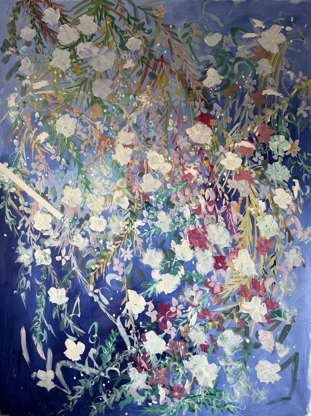
It is at its quietest in 02 | 2025 from the series Fifth Season #heaven can wait. On a deep blue that deepens to night blue towards the edges, a cascade of grasses and white blossoms falls from above, interspersed with bordeaux and old rose. There is no gold here. The light comes from the pale blossoms against the dark ground alone, across a format of 150 × 200 centimetres.

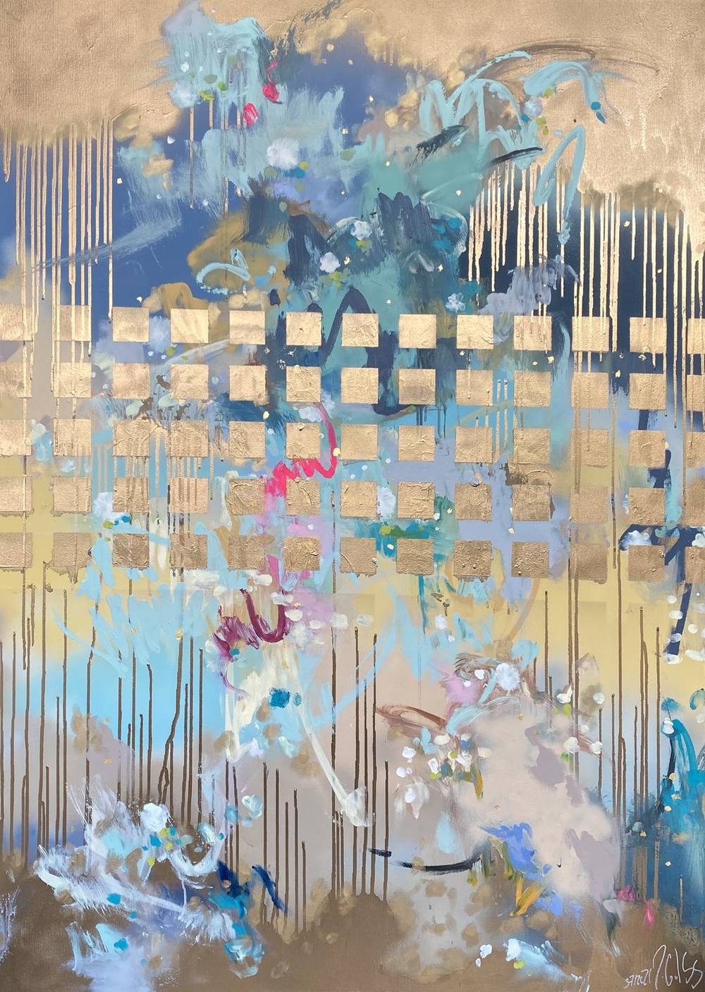
The relationship is quite different in 508 | 2024 from the Signature Collection. Over a moving ground of cobalt blue, petrol and turquoise lies a grid of golden signs: the JG monogram, the crown, the hare, the anchor. The blue remains loose and watery while the gold stands above it in strict rows. 37 | 2021 from the Golden Things series works in a similar way, with square fields of gold leaf set like window bars over cloudy ice blue, dove blue and night blue. Gold leaf, lacquer and matt acrylic each answer the light differently.
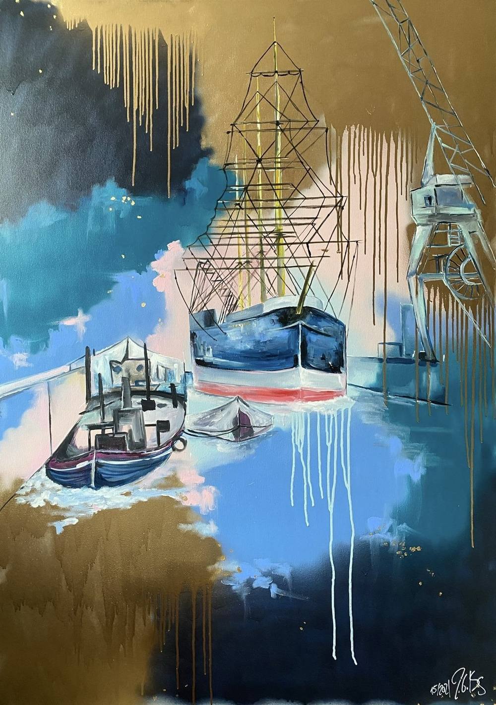
In 15 | 2021, broad fields of gold frame a harbour of turquoise, sky blue and night blue, with golden and white drips running vertically through it. Here the blue is water and sky, the gold the light that falls upon them.
Blue and pink
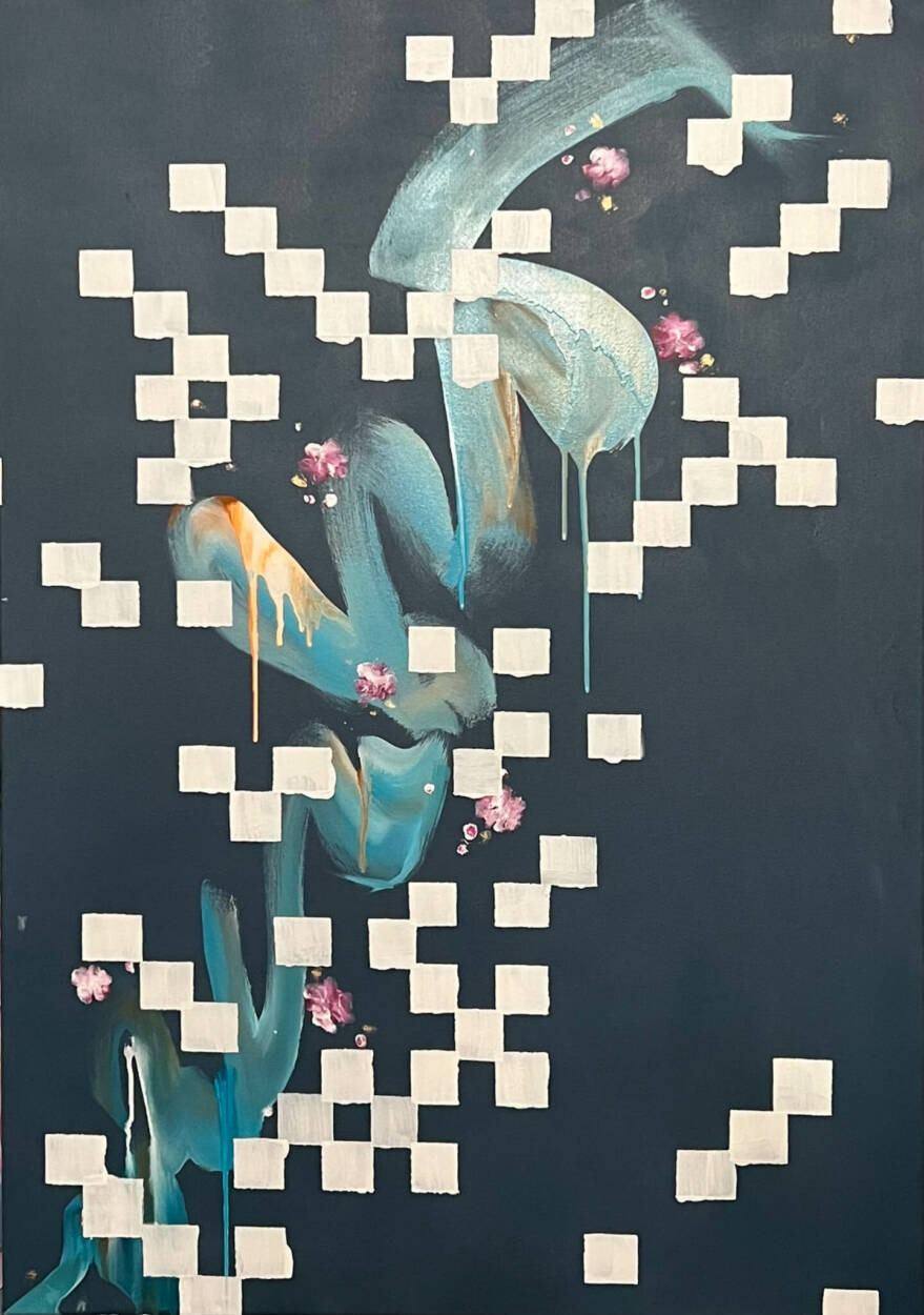
Alongside gold, pink is blue’s second partner in this work. In 25 | 2022 a drawn hare in a pink costume stands before a blue-grey sky, with two bands of gold squares. The pink provides the warm accent, the blue gives it depth. In 28 | 2022, small pink blossoms sit like seals on a grid of cream squares, set on a deep night blue crossed by brushstrokes of ice blue and petrol.
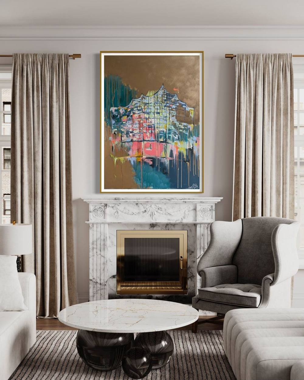
This interplay can also be tested in a room. The visualisation below shows a Hamburg motif with a wave-shaped roofline above a marble fireplace. Petrol, blue and patches of coral and pink stand against a broad gold ground. The light room, with its marble, brass and muted fabrics, picks up the warm tones, while the blue forms the cool counterpoint.
The colour blue in art and in your own room
A great deal is claimed about the effect of blue in a room. Whether a picture calms or enlivens, however, depends less on the colour alone than on the painting itself, the light and the surroundings. A deep night blue behaves differently from a pale ice blue, a blue with gold differently from one without.
Concrete observations in the actual space are therefore more useful. In morning light a work appears cooler. In the evening, under warm light, gold lacquer and gold leaf begin to glow. The balance between blue and gold shifts over the course of the day. Walls in warm white or sand give blue paintings a calm setting, and brass and wood pick up their golden elements.
The art advisor leads straight to suitable originals with the colour choice “Cool” (blue, petrol, sage), and the catalogue can also be filtered by colour. How gold and blue come together in the work is described in more detail in the article on gold leaf in painting. For a small fee, credited against the purchase, any available work can be hung on approval. Your own light will show what no text can anticipate.
Works from this article
Frequently asked questions
Why was ultramarine so expensive?
Ultramarine was made from lapis lazuli, which reached Europe from Badakhshan in present-day Afghanistan. The stone was hard to obtain and the pigment needed careful purification. The National Gallery in London notes that it was sometimes even more expensive than gold.
When was Prussian blue invented?
Prussian blue, also called Berlin blue, was discovered more or less by chance in Berlin in 1706. The colour maker Johann Jacob Diesbach and the theologian and alchemist Johann Conrad Dippel were involved. Around a century later Hokusai used the imported pigment in his Great Wave.
Did Yves Klein patent the colour blue?
No. On 19 May 1960 Klein deposited a Soleau envelope with the French Institut national de la propriété industrielle. According to the Centre Pompidou, what he sought to protect was the process, the combination of ultramarine pigment with the synthetic resin Rhodopas M, not the colour itself.
Which works by Juliane Golbs are blue?
After gold, blue is the most frequent defining colour family in her catalogue. Examples include 02 | 2025 with blossoms on deep blue, the harbour painting 15 | 2021, the round 508 | 2024 and 28 | 2022 in night blue and cream. In the art advisor, the colour choice “Cool” leads to these works.
Sources
8 sources
- Royal Society of Chemistry: Egyptian blue
- The National Gallery, London: The Wilton Diptych: Ultramarine
- Alexander Kraft: What a chemistry student should know about the history of Prussian blue (ChemTexts, 2018)
- Académie de Lyon, Dictionnaire historique des académiciens de Lyon: Guimet Jean Baptiste (1795–1871)
- The Metropolitan Museum of Art: Hokusai’s Iconic “Great Wave”
- The National Gallery, London: Pablo Picasso, Motherhood (La Maternité), 1901
- Staatliche Museen zu Berlin: Chronology Kosmos Blauer Reiter
- Centre Pompidou: L’histoire secrète de l’International Klein Blue (IKB) d’Yves Klein